What led you into design?
Growing up I was always fascinated by bright colors, patterns and huge type on posters. One of my first creative outlets was making story books of random, mundane events and gifting the books to friends. While I appreciated the storytelling aspect, what I enjoyed the most was laying out the pages and making the illustrations. When GeoCities came out, my life changed. I fell in love with the blink tag, the counter, the custom cursor, repeating background patterns and the GIFs! I started making websites of random things like, heart shaped islands, power rangers forever, pizza and hot dogs, and others themed around my interests at the time. I would spend hours uploading images, exploring different layouts, and playing with font size and color. At the time, I was just doing this to have fun. I didn’t realize it was the beginning of my life in design. It was my high school teacher who pointed me in the direction of design. I started taking drawing classes at the Art Institute of Chicago while in High School. It wasn’t until I got to college that I “officially” discovered web and graphic design.
What does a typical day look like?
I usually wake up at 7am and start my day by meditating. I use Simple Habit. I then rush to get to work by 9am and have breakfast. From here, every day is different. Usually I begin the day with meetings– figuring out scope of projects, have brainstorming sessions, and provide feedback to illustrators. I usually start designing at 2pm and don’t stop until I either get hungry or feel I’ve reached a good spot. If I’m in the zone I will continue working until late into the night. After work, I often either meetup with friends, or go to design or gallery events. If I head straight home, I’ll make dinner, and start working on either a side project, a random gif, or an illustration that I then post to instagram.
What’s your setup?


Where do you go to get inspired?
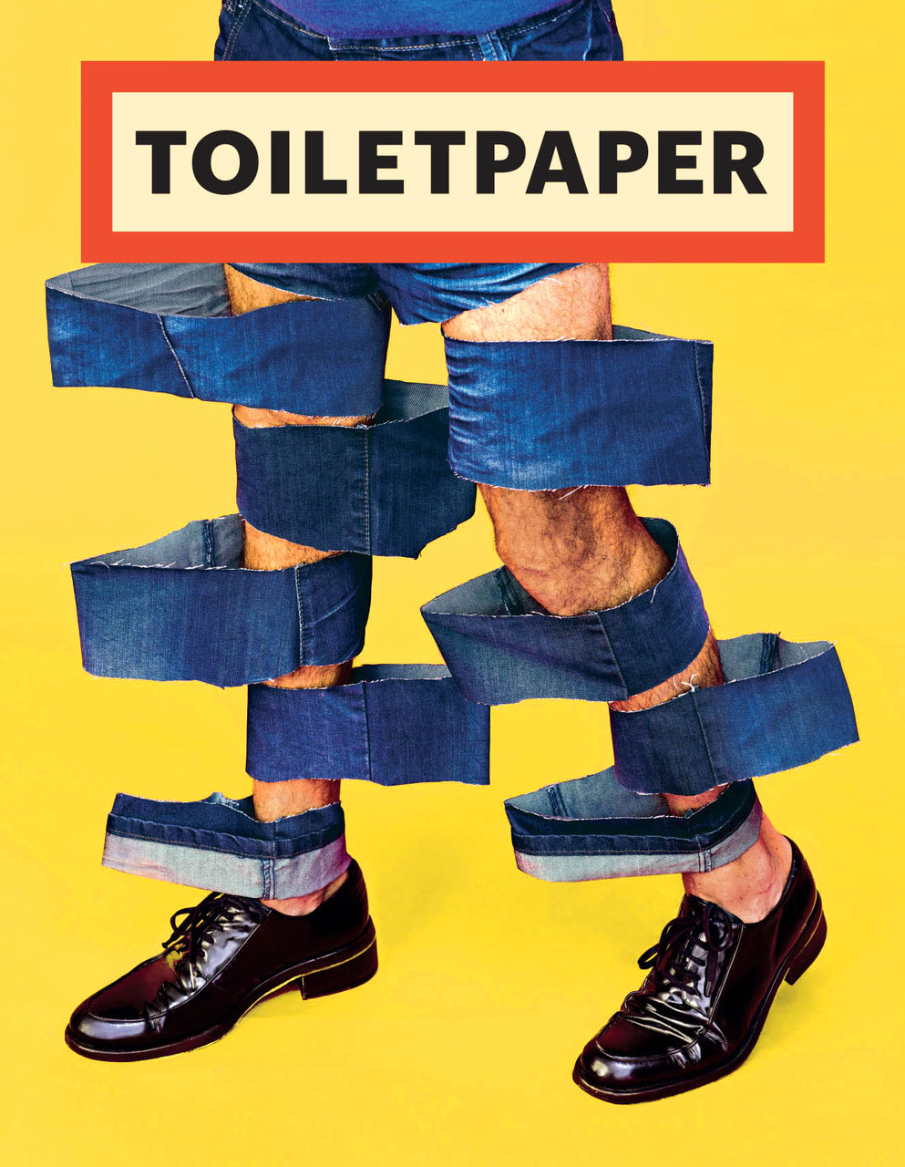
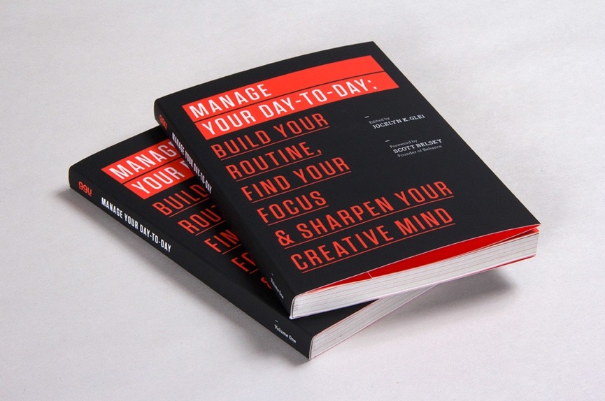
There is not one specific thing I do to get inspired. Some approaches I use is clearing my mind with meditation, going out for a walk while listening to a podcast, visiting museums & galleries like Spoke Art or Hashimoto Contemporary in San Francisco, or spending way too much time on Muzli. When going out for walks I like to listen to “Heroine,” a podcast about real and meaningful stories of top creative women leaders. If I’m online I often visit 99U and read many of their books for design/career advice. Currently I am reading, “Manage Your Day-to-Day.” One of the key takeaways, for me, involves establishing “associated triggers” – such as listening to the same music (I listen to Blackbird Blackbird) or arranging your desk a certain way in order to tell your mind it’s time to get to work. I also like to browse through fubiz, It’s Nice That, Toilet Paper Magazine and vimeo for unique art and perspectives.
My current favorite video on Vimeo is an action-packed pop art Japanese monster movie set in the wild west called Scary Prairie.
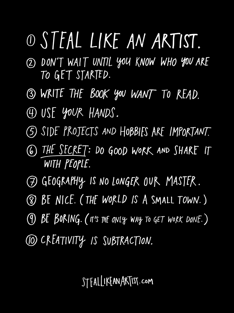
Lastly, when I am feeling stuck I like to browse through Austin Kleon’s, Steal like an artist, book. I especially like his list of of 10 things he wished he’d heard when he was starting out.
What product have you recently seen that made you think this is great design?
Recently I have been using Mimo every day to improve my coding abilities. I highly recommend it. It’s like duolingo, but for coding. You can learn how to make a website, or build an app.
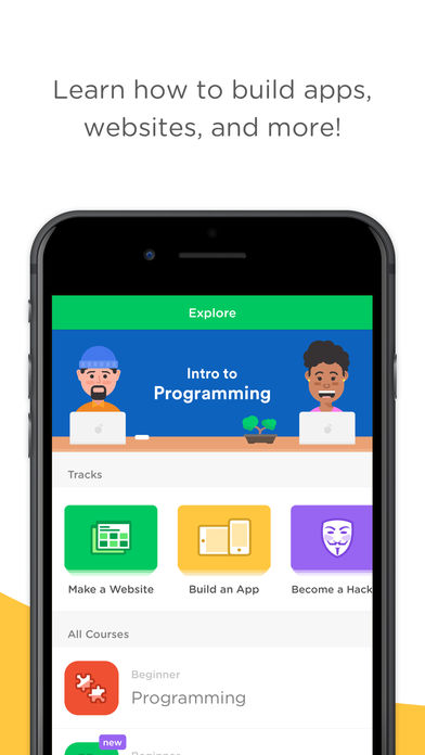
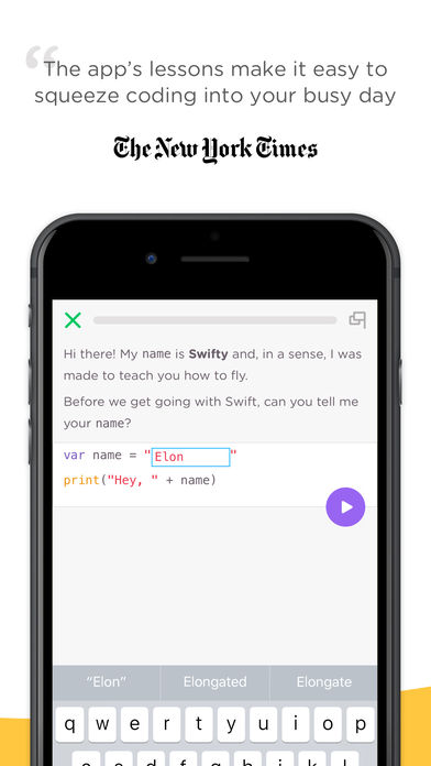
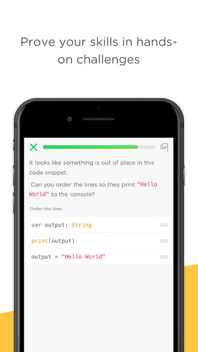
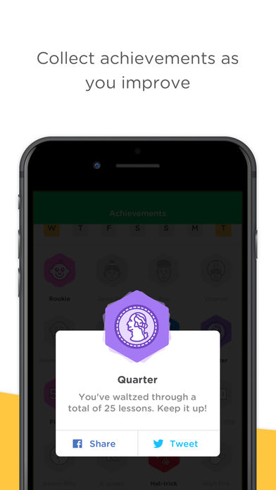
Also, just recently, I saw the work of Tom McCarten and have been obsessed with his animation and collage skills. He combines both skills to tell compelling stories.

What pieces of work are you most proud of?
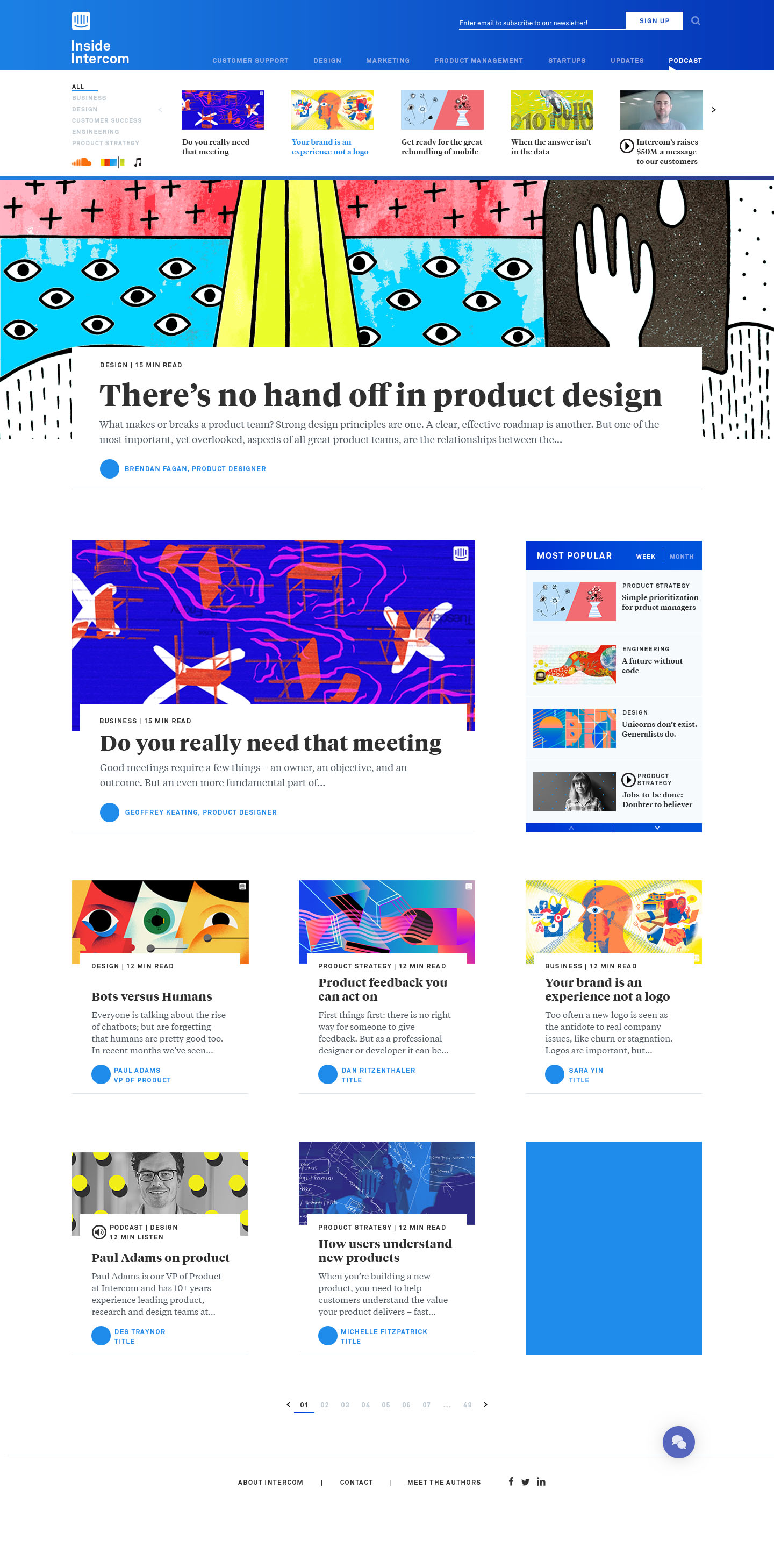
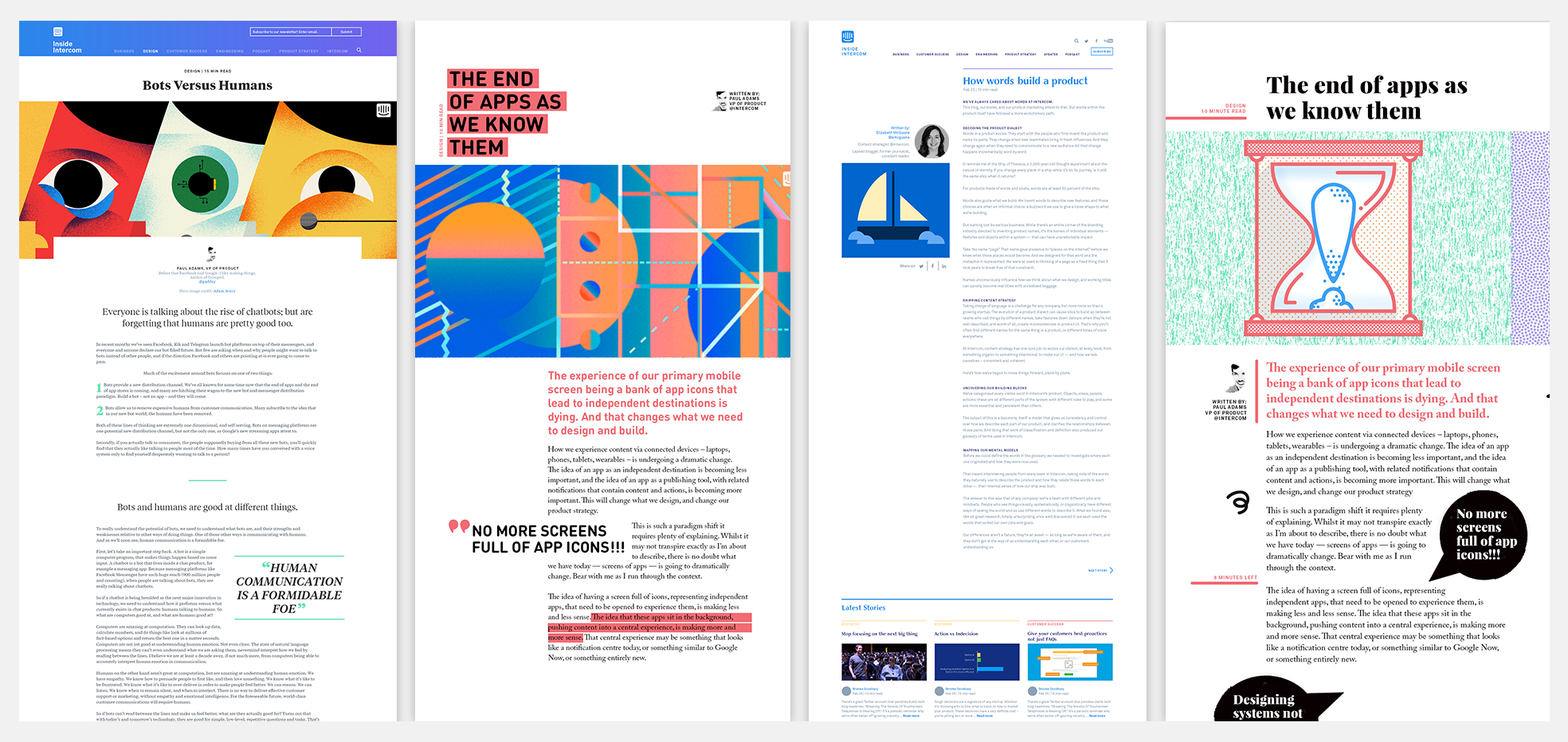
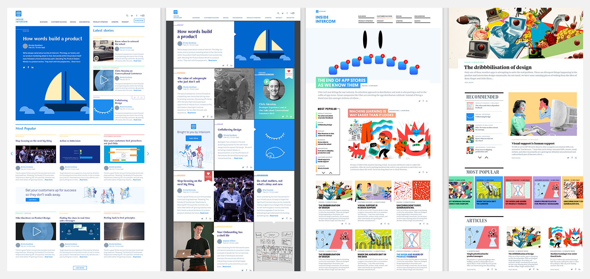
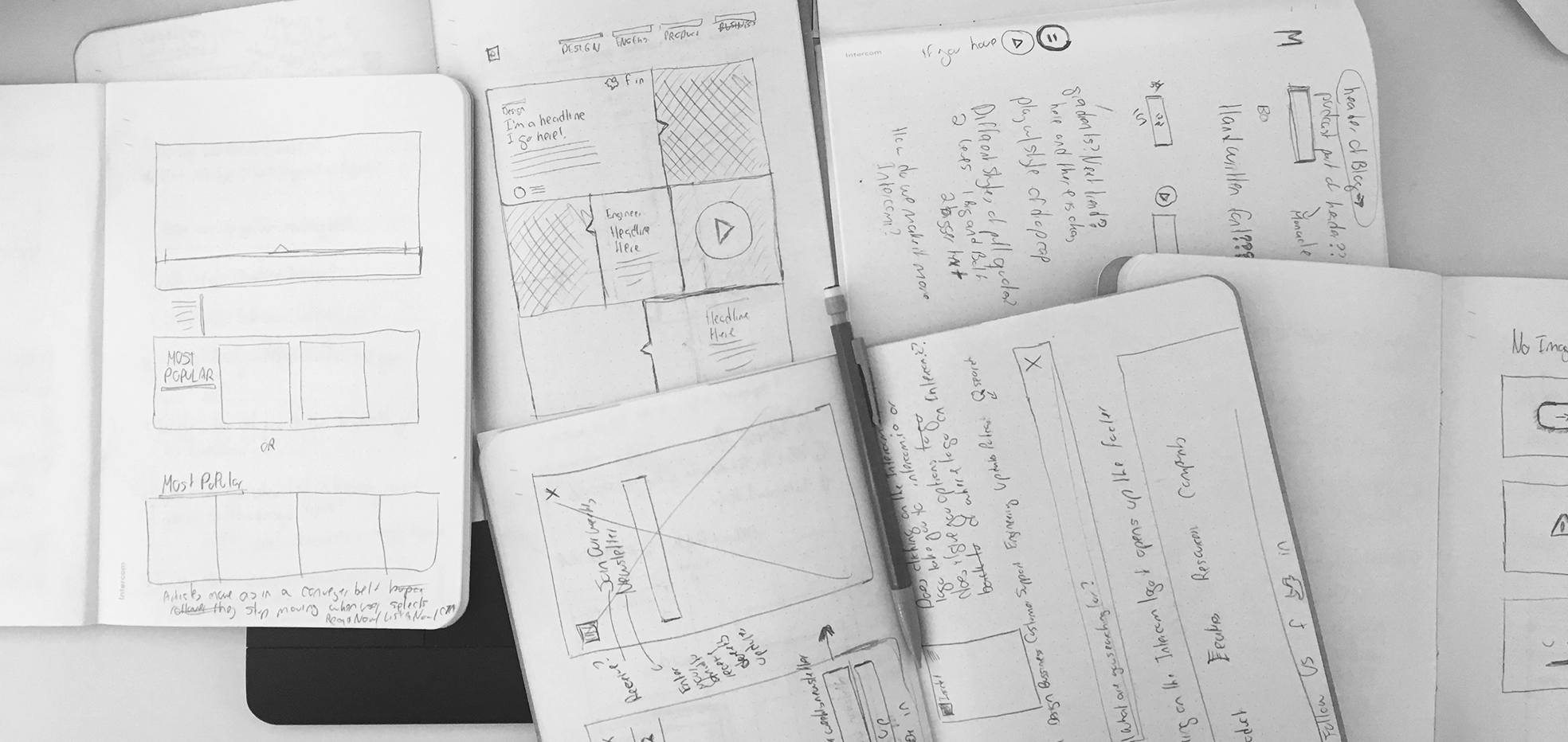
While at Intercom I worked with Stewart Scott Curran @stewartsc on the Intercom blog redesign. Intercom wanted to introduce a new design for their blog that would showcase their podcast, books, their world tour: Inside Intercom and weekly posts from employees. The goals for the blog redesign included: easy discoverability of articles within different verticals, increase newsletter sign ups, ability to promote Intercom product features, books, and podcasts and easy consumption of material being published.
I’m very proud of this because we pushed the design and created a blog not typical for tech - with a compelling personality that draws the reader in. I also really like how everyday a new illustrator is featured; their awesome work makes the blog incredibly visually appealing.
I worked on the Medium brand redesign with Chad Thornton @chadtee. Alongside, Manual Creative, we redesigned the Medium wordmark. This redesign came from Medium’ refocus on their mission to connect readers and writers. We wanted to create a wordmark that would reference the tradition of print publishing but also feel timeless and fresh in the digital context. Everything from the illustration style, type and color choices references print.
I really enjoyed working on establishing the art direction and working with amazing illustrators, such as Nate Kitch, Natalie Nelson, and Matt Chase. Check out medium.com/membership

What design challenges do you face at your company?
One of the biggest challenges at Medium has been being the only brand designer, while multitasking several projects on tight timelines. It can be hard to say “no” to projects when you know there is not another brand designer to do the work. On the upside, being the only brand designer has made me more critical of my work and seek out outside perspectives.
What music do you listen to while designing?
Any advice for ambitious designers?
Remember that any design you make is not for you – always think of your user first and what resonates with them. Keep pushing your designs until you feel you have taken them as far you can. It’s best to make something “weird” and then dial it down. Have fun! Designing should be fun and should not feel like work.
Anything you want to promote or plug?
My instagram where I mostly post weird gifs or heavily patterned illustrations. Also, my friend Majo’s podcast, Heroine, for inspirational stories of creative women leaders.


