What led you into design?
It’s hard to tell exactly when design became my profession, but I know that it has always been one of my favourite hobbies since I was a kid. Actually, I never thought that what I was doing was design back then. It was more like just messing with Photoshop, which was my favourite toy. Growing up, I found other toys such as Flash, 3ds Max, Dreamweaver, After Effects, and so on. I just kept creating random stuff with them for fun, and after a certain point, I somehow started getting paid to do it.
My first full-time gig was as a motion graphics designer. I enjoyed it for the first few years, but it didn't satisfy my thirst for creating something interactive. I ended up joining a digital agency as a UI designer without any knowledge about how to design interfaces. I basically learned by doing, as I designed dozens of mobile apps with a lot of help from amazing developers. Afterwards, I joined an early-stage startup, where I completed designs for a number of different products. For me, I think working in a small startup team provided me with the best opportunity to experience product design from idea to launch. In addition, it helped me to learn various skills beyond simply designing.
Looking back, the decision to switch my career path from motion graphics to UI design has taken me to new heights and has opened up more doors than I ever expected it would. I went to San Francisco to join Evernote Accelerator, and then went to Sydney to study for my Master's degree in interactive design. Now, I live in Melbourne and work at Envato. When I look back at my journey, I still feel as though it has all happened so fast.
What does a typical day look like?
I usually start the day by choosing where to work. I work from home when I need more focus time, and head to the office when I'm feeling a bit siloed. I think Envato is one of only a few companies in Australia that offers both a great remote working culture and also an awesome office.
A typical day at work differs, depending on the type of problem that I'm trying to tackle or the shape of the solution that I'm implementing. It's usually a mix of the following tasks: updating and maintaining UI library, designing concepts and mockups, prototyping, giving feedback on other designers' work, researching and experimenting with new methods and tools, reading and writing design documents, and attending many meetings.
When I'm not working, I spend most of my time with my wife. We're both designers who deal with similar problems in different industries, so we tend to talk about design and digital products quite often. It's great to have someone very close to me who understands my daily struggles as a designer, and also as an immigrant. We are both from South Korea, and we feel very privileged and lucky to live in Melbourne. This is an awesome place to live with peaceful parks and stunning beaches.


What’s your workstation setup?
A laptop hooked with larger displays on a standing desk. My setup is pretty much the same at the office and at home.
Home office:


Envato Melbourne office:


Where do you go to get inspired?
It depends on what I’m looking for at the moment, but when I have no idea what I’m after, I often just scroll through Twitter feeds to sneak a peek into other people's workflows, processes, and thoughts (and memes). I would say it's more mindless wandering than purposeful inspiration-seeking. Frankly, it very often feels like a complete waste of time, but once in a while, I find something valuable. This sounds like I just described a recipe for an addiction.
I often find the process of the work more intriguing than the result. One of the reasons I prefer buying movies on iTunes over watching them on streaming services is the commentaries and behind the scenes content that usually comes with. It is so fascinating to see how people work together collaboratively to create such incredible work. Just observing the way those passionate people think and work motivates me greatly. Maybe passion is indeed contagious.
What product have you recently seen that made you think this is great design?
I think that great designs are often overlooked because they're unobtrusive, whereas finding bad designs is effortless. I thought about which products I use every day habitually, and one of them is Things. I've been using this app from its version 3 launch, and now it's on my phone, laptop, and watch. Things has a very clear but flexible structure, so it's simple enough to just use for creating a grocery list, but is also capable of handling more complex checklists.

Other than digital products, I recently bought a LÅNGFJÄLL chair from IKEA, and I've been very satisfied with it, even though I have no clue how to pronounce its name. This chair is simple and solid, and is just pleasing to look at when I'm not sitting on it.

What pieces of work are you most proud of?
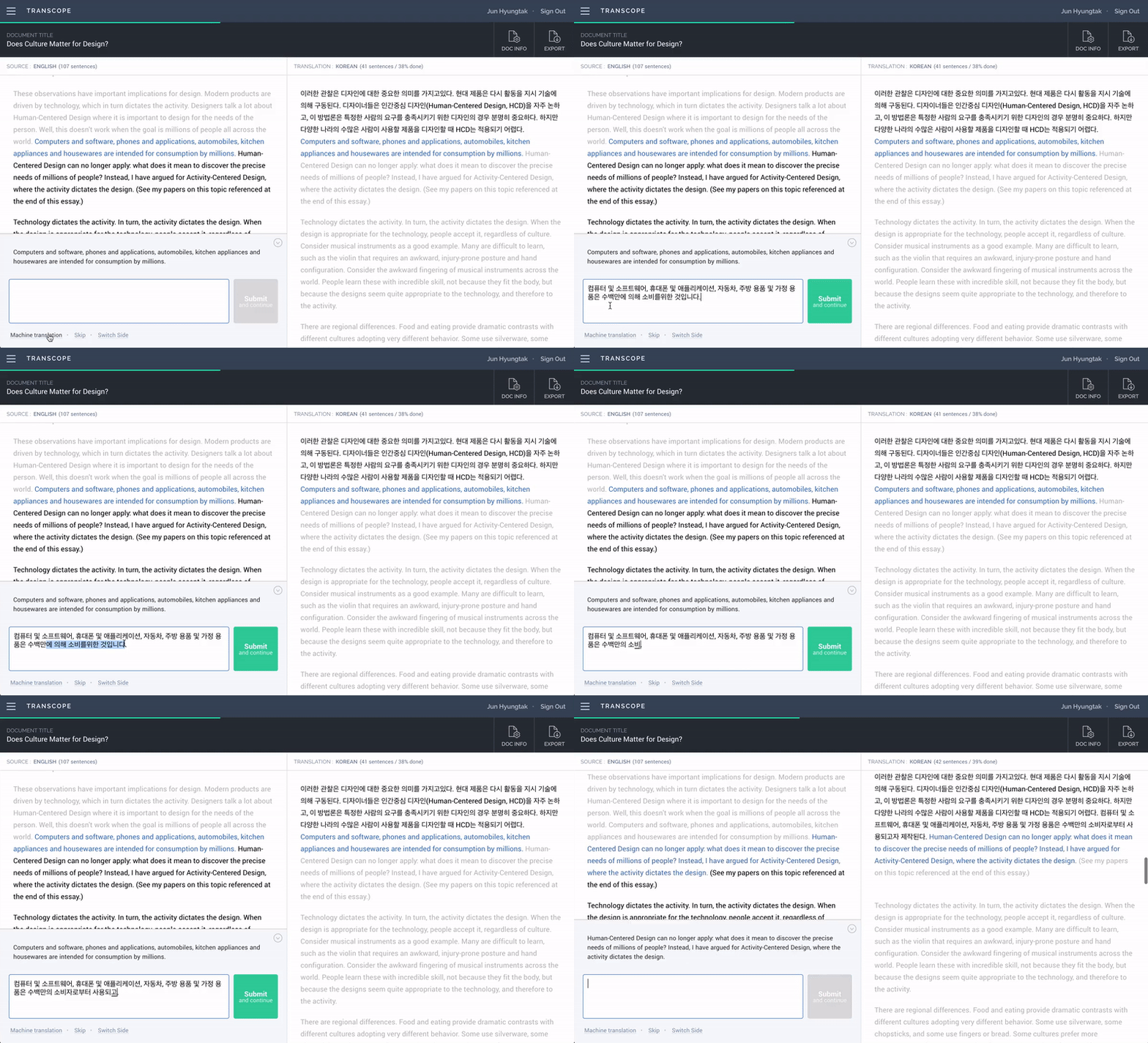
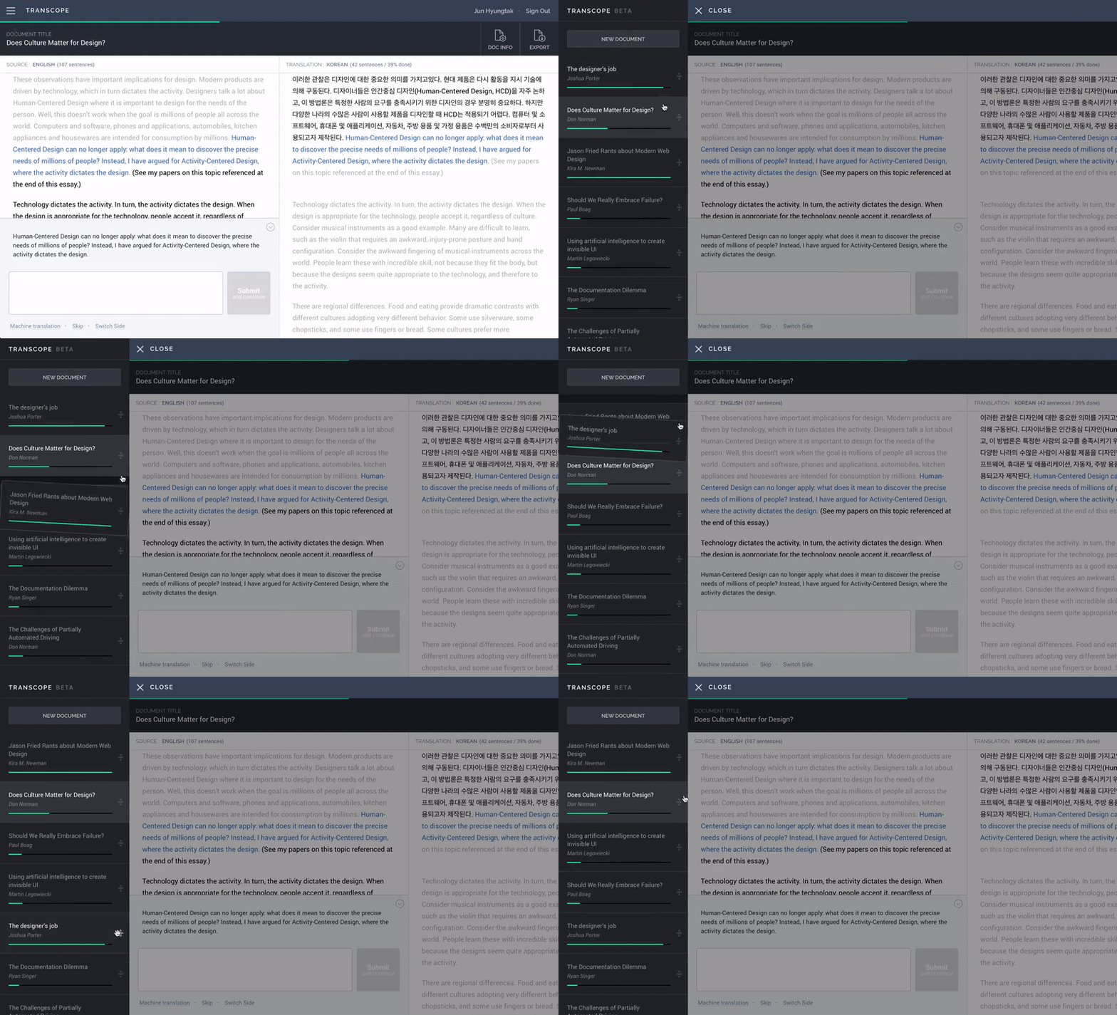
Back in 2016, I was very much into two things: learning JavaScript and translating articles. The combination of the two somehow turned into a single side-project. I named it Transcope. It's a web app for casual translators. The 'why' part of this project was clear. I needed it, but I couldn't find anything like this. Translation software are usually designed for professionals, which means that they’re complicated and expensive. The problem was the 'how' part. It was clearly beyond my development ability, but I guess ignorance was bliss in this case. I just had no idea how difficult it would be.
Eventually, it took three months of my evenings and weekends, and during that time, I watched countless online tutorials, attended a part-time JS course at GA, and even dreamed of desperately searching for something on Stack Overflow (it was a nightmare). However, every bit of my effort felt worthwhile when I finally saw it working from sign-up to export. I think I've been always tinkering with code from a young age, but Transcope was the first working web app that I built on my own with a proper front-end and database.


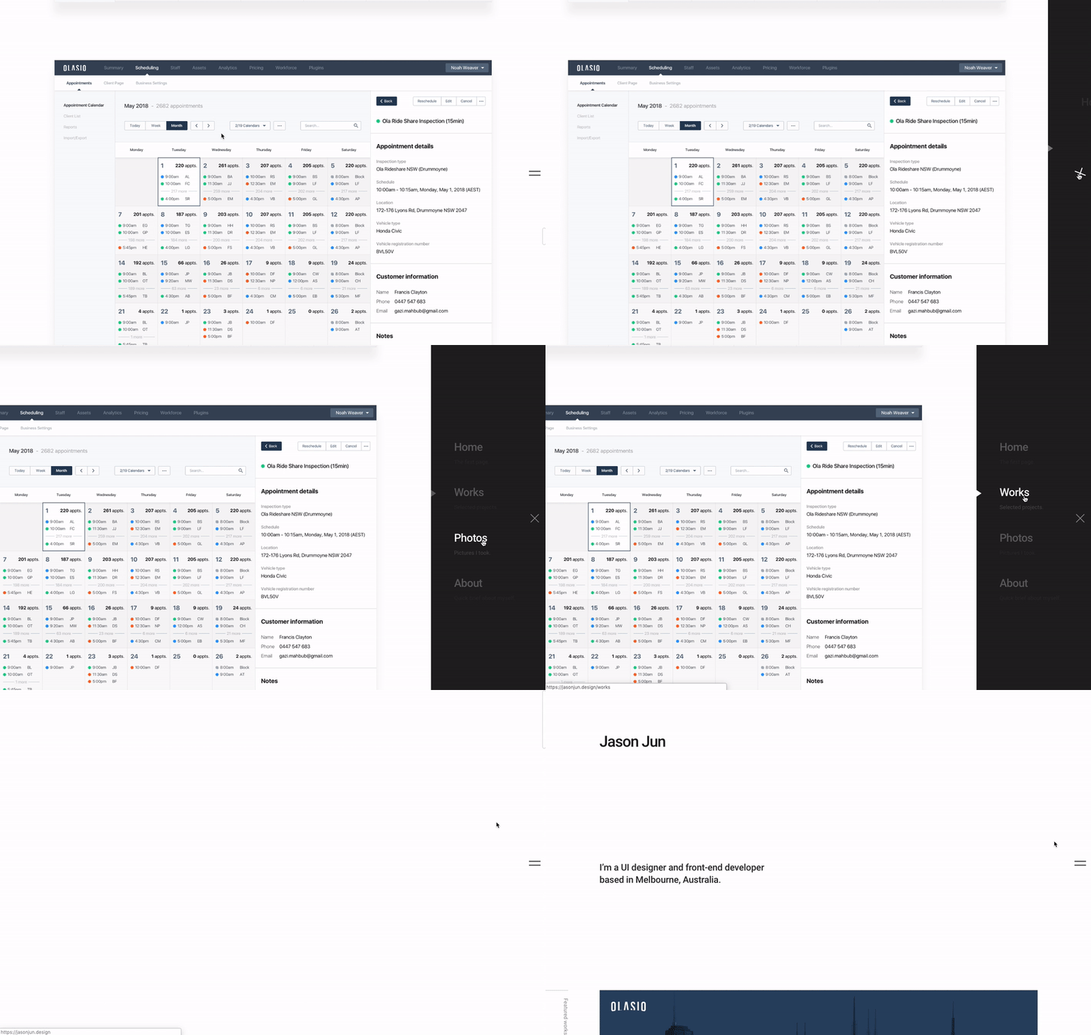
Another work that I'm fairly happy with is my portfolio website, which I made several years ago. Although rather lately, I’ve seen many designers use social media to showcase their works, my preference is to design and develop a website from scratch when it comes to creating my portfolio. It's a great opportunity to review and analyse my past projects, and also a good excuse to try new frameworks, tools, and services that are not easy to try at work.


What design challenges do you face at your company?
A big part of my job is to design and maintain the UI library and design systems. I think the benefits of reusable components and design systems are generally understood amongst designers, but opinions can be divided as to how flexible the system should be. Rules and guidelines that are too strict can demotivate creative attempts and incentivise a team to not question the solutions already developed. But if the system is too flexible that it barely saves any effort from anyone, then the whole purpose of it can be rather weak. This is certainly not the kind of problem where we can borrow the solution from another company, because the solution is basically a sum of numerous small decisions that need to be made at different points throughout the process.
One more consideration to this is that process enhancement don't necessarily lead to improvements in the user experience. In fact, it's easy to forget the purpose of design when you focus too much on technical or methodological details. A common mistake I see lately in the design field is putting process and system before the product. I like this quote by Michael McWatters (Experience Design Director at TED), “Design what’s right, not what’s most consistent. The best utility of the page is a priority. We’ll modify the page to make it work. Dogmatic consistency and established patterns are not what should drive design decisions.”
What matters, after all, is the user experience. If our products fail to bridge the gap between the user and their goal, the speed and efficiency we accomplish in the process won't even matter.
What music do you listen to while designing?
Any advice for ambitious designers?
Having a profound understanding of the platform on which your design is based can be significantly helpful. You seldom, if ever, design a product without contextual constraints. For example, you need to know the road rules to properly design a car. In the same manner, it’s important to learn about the types of available interface controls and the standards of major web browsers and operating systems to design usable and accessible interfaces.
Anything you want to promote or plug?
I'd like to mention two of my favorite newsletters. Dense Discovery by Kai Brach, and Web Development Reading List by Anselm Hannemann.
And I'm @jsonjun on Twitter and Instagram. Thank you for reading!


