What led you into design?
It’s really hard to pinpoint a single moment to answer this question. My parents raised me with a balanced influence of creativity and scientific curiosity. As far as I can remember, I’ve found myself working in creative endeavors, only to find myself creatively exhausted and leaning on the rigor and certainty of technical challenges to regain that creativity while still feeling productive. It wasn’t until a few years ago I realised that I could get away with being creative in a highly technical way, being a designer that primarily uses code as a design tool.
In truth, I still feel like my ‘calling’ is somewhat unknown, but design is a thoroughly satisfying line of work to do and draws from many industries and practices to solve an overwhelming range of problems. That’s really what led me to it, I guess—the fluidity of the job, and the call to action it presents: there are hard problems to solve here, for the benefit of others.
What does a typical day look like?
Monday to Friday, I wake up around 7am and jump on a 7:40 shuttle to Facebook’s Menlo Park campus. I’ve recently been making a lot of homemade bread, so a couple days a week I’ll wake up a little earlier and put together a pre-ferment which I turn into dough later in the day. I’ll get to work around 8:30am, grab a big breakfast, then head to my desk.
I have a 2-hour block on my calendar each morning to triage emails and messages and get some tactical work done. Since I joined the BIG (Business Interface Guidelines) team, many of my working hours are spent in meetings and writing documents. On a design system team, this is typical, and I’ve actually grown to love this kind of work. It feels great to have productive negotiations with teams to encourage them to adopt standards, field their ideas, hear their pains, and work to address them.
A few times a week, we have team critiques/working sessions, during which we share what we’re working on or bring a deliciously difficult problem to the whole team’s attention. Designers and Engineers come together in those meetings to talk about the implications of early decisions on the wider system. I love having such a strong cross-functional team, especially as a designer with a deep interest in code.
I usually aim to leave the office around 4:20pm, and I’ll spend the shuttle ride home continuing work, reading, or working on generative art pieces. When I get home, if that pre-ferment is waiting for me, I’ll mix it up into dough, or bake a dough that’s been waiting in the fridge. (Bread has become a pretty significant part of my life lately, leading to about 3 fresh loaves a week).

What’s your setup?
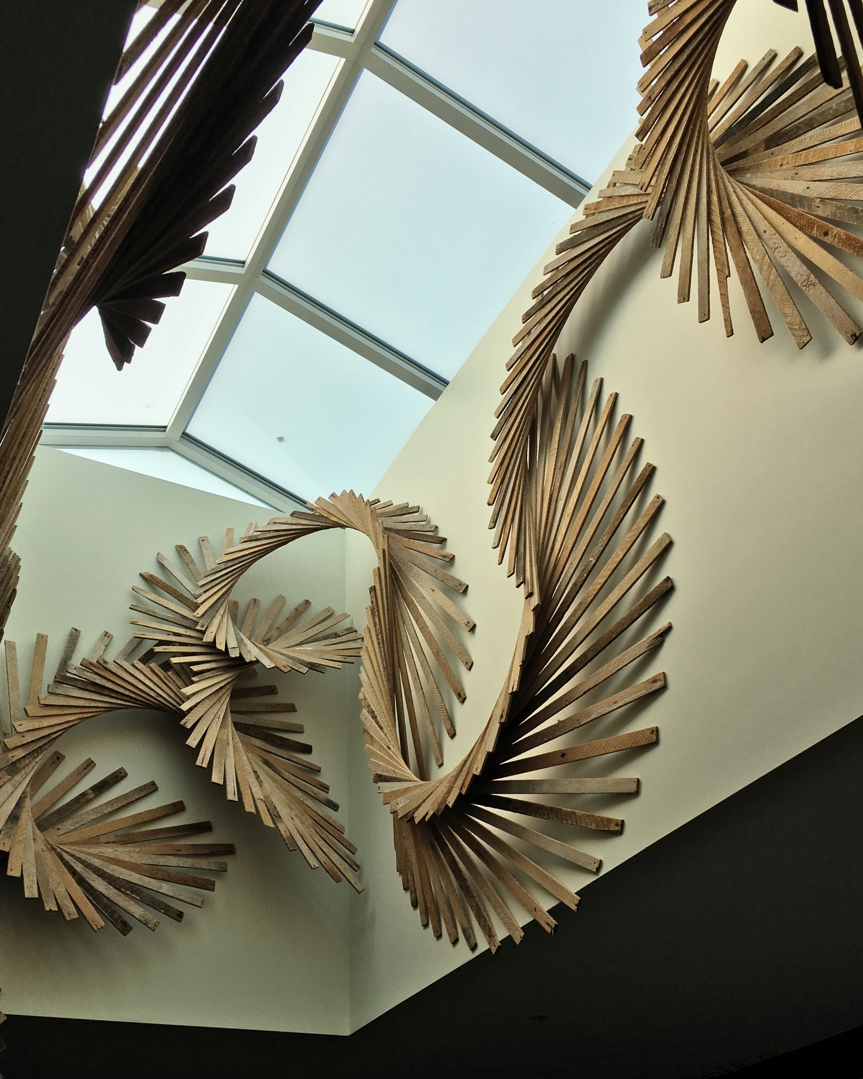
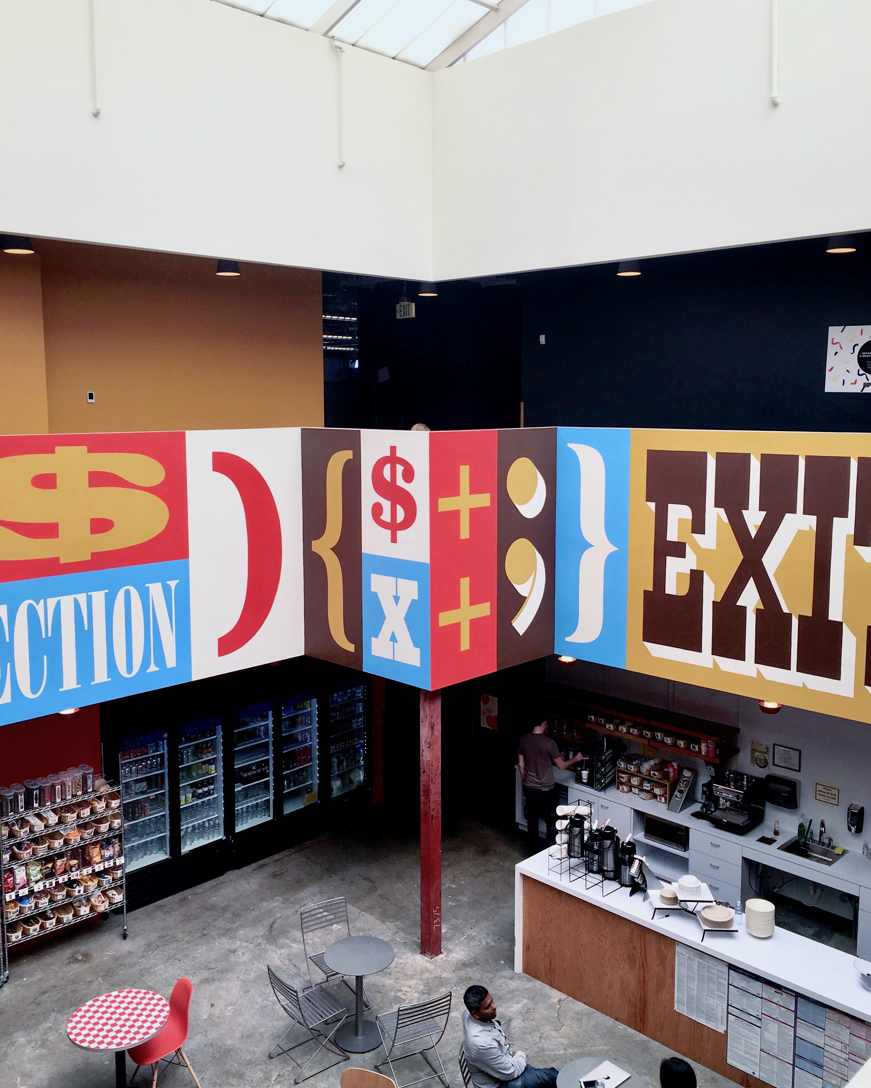
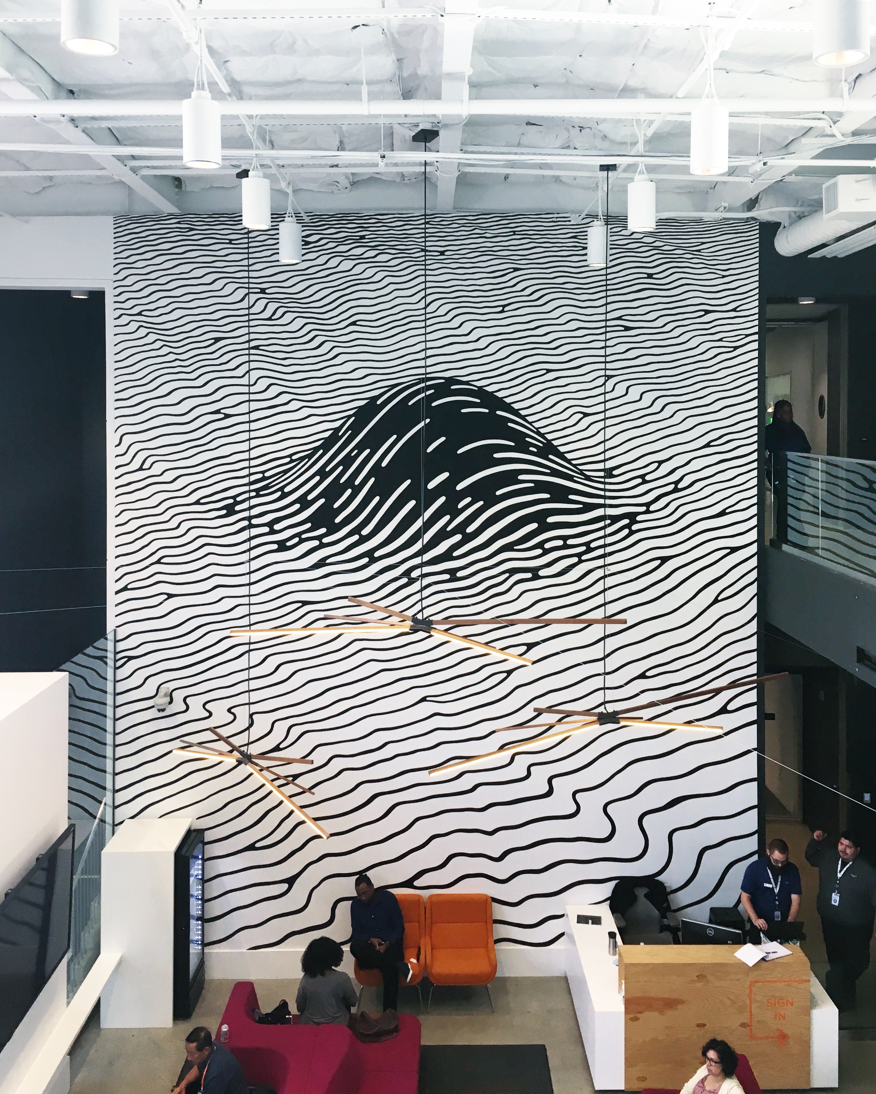
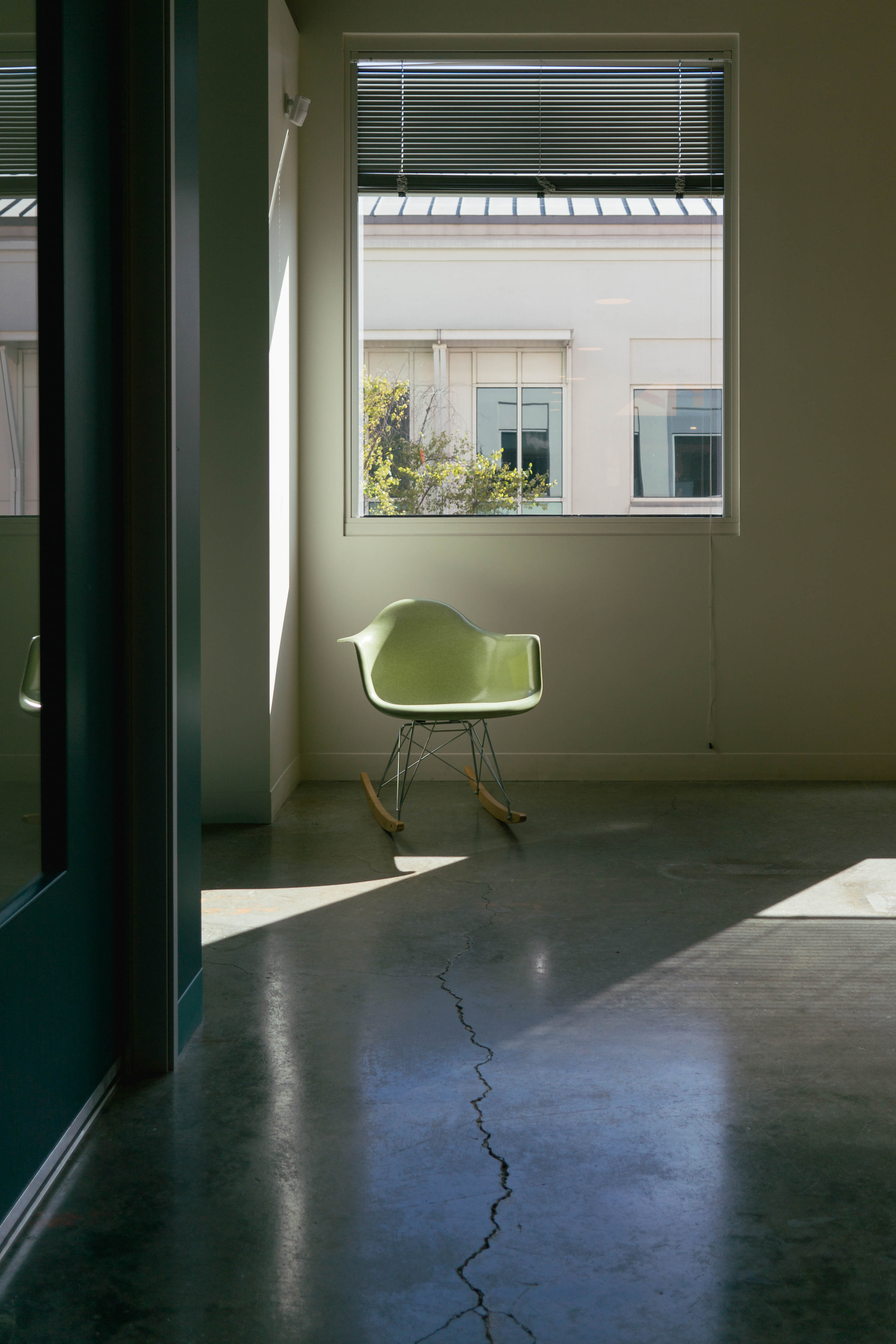
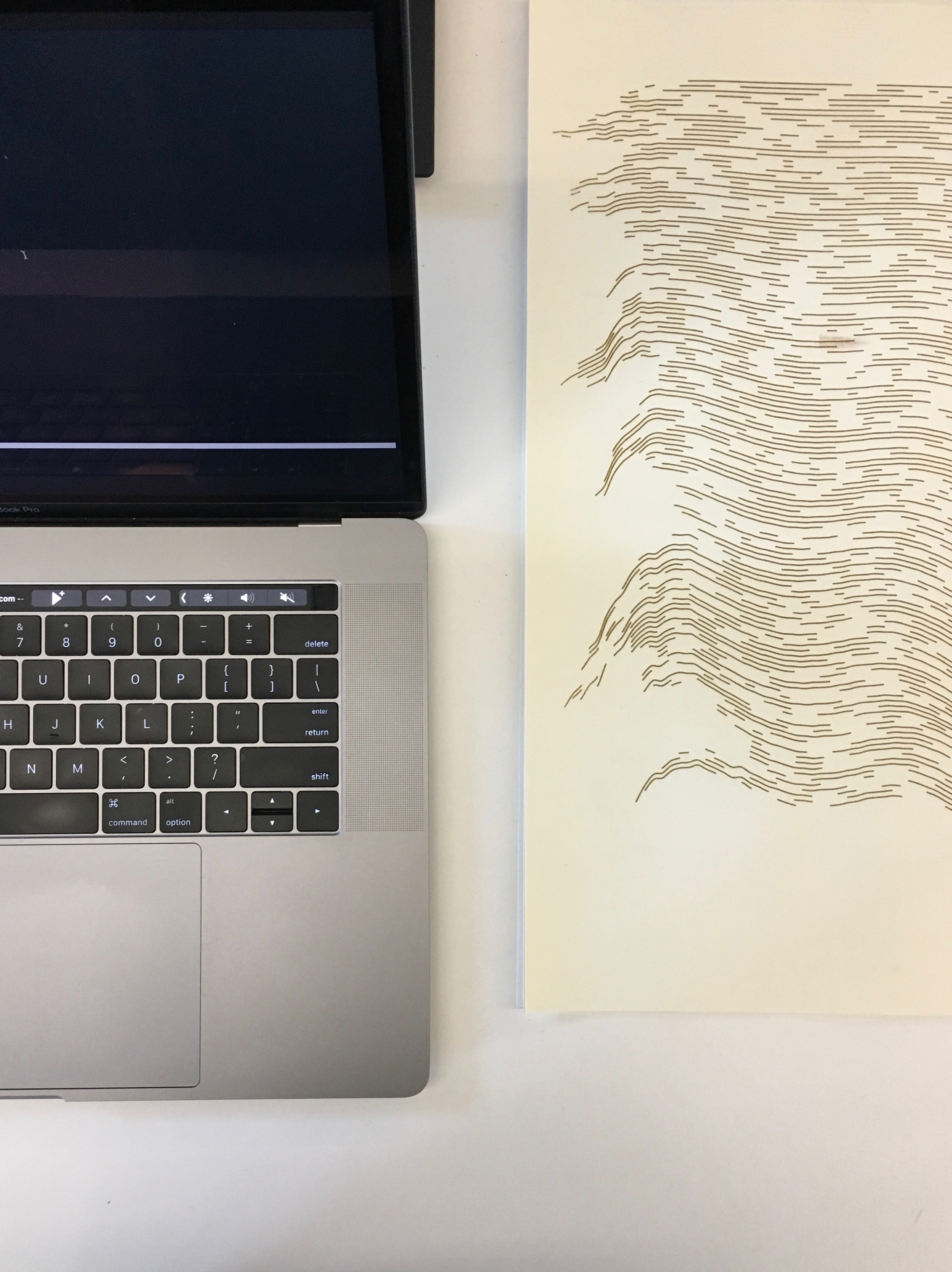
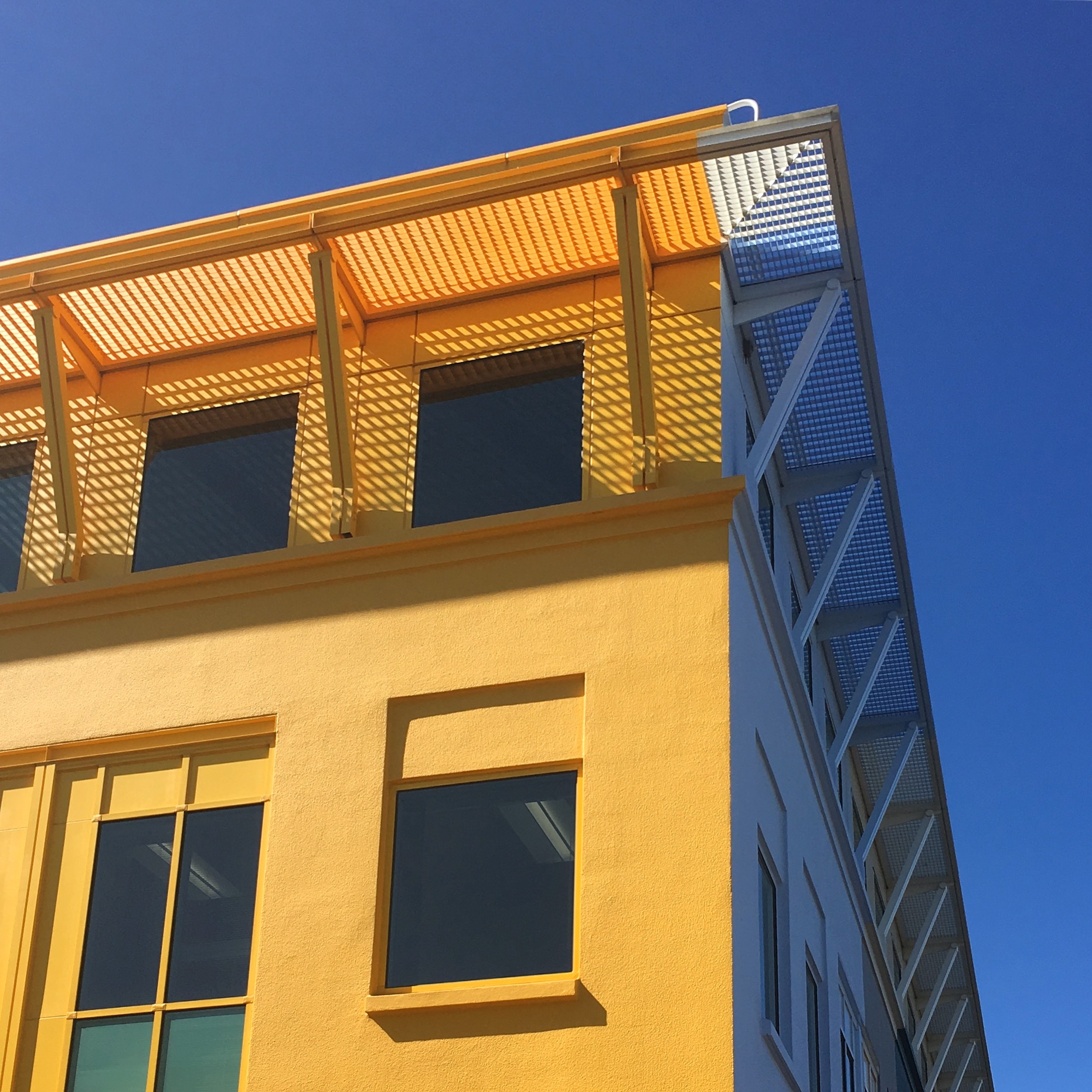


Where do you go to get inspired?
I’ve been frequenting the New York Times several times a day lately. I just started paying for a subscription—partly for their recipes and crosswords— mostly because their visualisations are a constant source of inspiration. Their graphics team is consistently putting out phenomenal work, including the covers for the New York Times Magazine, which Gail Bichler always helpfully surfaces.


I’ve also been turning to books for inspiration in my systems work; reading a range of titles in architecture, statistics, psychology, and mathematics—all the essential pieces of system design.
For my generative art, I find most inspiration in nature and natural, dynamic systems. I tend to work on pieces that demonstrate the cumulative effect of many actors—particles, points, shapes—under simple conditions and relationships. A beautiful example of this in nature is the murmuration of starlings. It’s the kind of display that I could watch for hours on end.
What product have you recently seen that made you think this is great design?
I’ve been gaining increasing fondness of Devon Ko’s Primitive zine: the identity design, the featured artists, and Devon’s own spirit and enthusiasm really shine in the work.

I’ve also fostered a quiet admiration for Google’s hardware design. A few months ago I got a Google Wifi and a Google Home. The software and voice commands are really well executed, but the hardware design has a simplicity and beautiful use of materials that make them sit squarely in the category of design that’s easy to forget, but a pleasure to look at when it crosses your gaze.

What pieces of work are you most proud of?
At Dropbox, two of my favorite projects was the launch of Dropbox Pro as a distinguished product and the introduction of user avatars. The former was an opportunity to work on something that very directly made the company money, which as a young designer meant a very tangible, measurable impact on my work. It also gave me an excuse to dig into coding at Dropbox, which was a lot of fun.

User avatars were one of those things that started as a really small idea and turned into a meaningful change for Dropbox as a product. It really started with a mockup in which I’d accidentally left an avatar next to the settings menu link. A PM I worked with said “Hold on; I like that. Why don’t we have user avatars in more places?” As far as anyone could tell, the only place we showed user avatars were on the settings page, and very few people ever uploaded one. One thing led to another, and before I knew it, avatars became a formal project. What was really cool was seeing other teams organically running with user avatars and asking themselves, “How would our feature/product look with faces instead of just text?” It unlocked a lot of potential for the Paper team, for example.
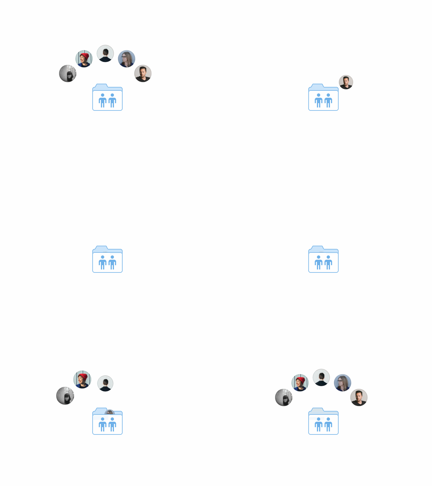
One of my favorite tidbits of the project was what I called the “faceholder”—a cute little androgynous illustrated face that’s seen by users who haven’t uploaded a profile photo. The faceholder turned out to be a huge driver for people uploading profile pictures—it was super clickable!—and for people who didn’t upload a photo, we kept hearing the same thing: the faceholder was just too cute to replace with their own photo.
I’m really proud to say that the work I did on Dropbox Pro and on user avatars is still in use today—a testament to the success of those projects and the hard work of the teams I worked with.
At Facebook, the work I’m most proud of has no visual artefact—at least, not yet. It’s a lot of drawing diagrams of concepts, but other than that, it’s mostly written documents, meetings, spreadsheets, and the occasional code change, adding components that mirror design abstracts, such as layout.

I think of this work as some of the most interesting and impactful I’ve done yet. It’s playing a long game, but the payoff will be significant, and I get to do it working with some truly talented, thoughtful, and passionate engineers and designers.
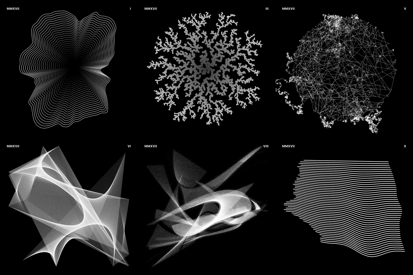
Finally, I’ve been continuing to explore generative art on the side, using Processing as my main tool. I made a goal this year to generate a unique piece for each of my monthly playlists for 2017, and keeping that promise has been fairly easy and creatively rewarding. I plan to publish both the playlists and the art pieces on a website before the year end.
What design challenges do you face at your company?
Facebook is now a seriously huge company, with interests and investments all over the place. Even just in the Ads and Business organization, there are dozens of teams working on any single feature or surface. Working on what is essentially an infrastructure team means a mix of balancing all these (sometimes conflicting) teams’ interests, producing general solutions that can satisfy many needs, and encourage responsible, thoughtful design and engineering solutions that will work at a huge scale.
My team is wrangling questions along the lines of: How can we develop a system that demonstrates the essence of Facebook without preventing creative or unique solutions? Where do we draw the line between advising and policing? And at a company where product surface is outpacing the growth of a system, can we build a system that can enable comprehensive, stable changes? The higher-level these questions become, inevitably we end up leaning on metaphors and less on visual design.
We’re also faced with the more immediate challenges of helping existing teams design and build products at scale with standardised UI components, as well as making these components general enough for use by brand new teams and products. It boils down to helping Facebook’s designers and engineers do their best work, which I really love being a part of.
What music do you listen to while designing?
Any advice for ambitious designers?
First of all, take it easy. Yes, you should work hard, but above all else, you need to look after yourself. Start to learn the signs that tell you when you’re at your limit: for me, working too hard means I hit a mental block and I struggle to find satisfaction in my work. Know that it’s OK to slow down or even stop for a while, breath, take a walk, read a book, eat some food, or talk to a friend.
Second, the only person whose pride in your work can make a measurable impact on your life is yourself. If you work hard on something that drives you, something that makes you proud, that feeling will carry you far. And if at times you forget what drives you, then that’s ok. It takes a long time, and it will change. Just remember the first piece of advice, and take care of yourself.
Anything you want to promote or plug?
I don’t have anything of my own I want to plug (ask me again in a year, and maybe some of my quiet side projects will have surfaced), so I figured I’d just list a few of my current favorite things:
N-gate is Hackernews but with sobering, critical, and deliciously witty commentary.
Bubblesort Zine, the thriving zine from Amy Wibowo (@sailorhg) is always worth surfacing. They’re delightfully illustrated guides to computer science and engineering topics, like cryptography, circuits, and sorting algorithms, and she just launched some sweet tshirts.
Spectrum is a beautifully designed community platform, and a good place to get design scoop and chat with design peers.
Finally, and the one thing I do have a personal stake in, is Wealthfront. I’ve been using Wealthfront as my main foray into stock investment, and it’s been both breezy and beneficial. That link is a referral, which means I’ll get a higher fee-free investment limit on Wealthfront.


