What led you into design?
As a child I enjoyed eating dirt, hitting stuff with a stick and finding berries that might be poisonous and then squeeze them between my fingers and freak out and walk home really fast, focused on not getting my fingers anywhere close to my face or mouth. That’s not related to design at all, but a childhood memory I think we can all relate to. As a kid I also spent a lot of time decorating the walls of my room, creating collages from cut up magazines. Later my dad brought home a Macintosh PowerPC 6100. It only had Photoshop installed, so I would do the tutorials over and over again. Later on, I had a short 5-year detour at university studying Information Science, and after that I opened my own studio in Copenhagen with a friend, mostly designing books and magazines. After a few years, I decided to take a bachelor degree in graphic design to learn the fundamentals. After that, I spent a few years freelancing before joining Vivino, where I’ve been for 4 years now.
What does a typical day look like?
With three kids no morning is the same - I’ll leave out the details. When I get to the office first part of the day is more talking and planning. Feels like the office sort of quiets down a bit after launch, so I often find a quiet corner and put on my headphones and focus. On my days to pick up the kids, I leave early and sometimes get in an hour or two of work, when they are asleep.
What’s your setup?
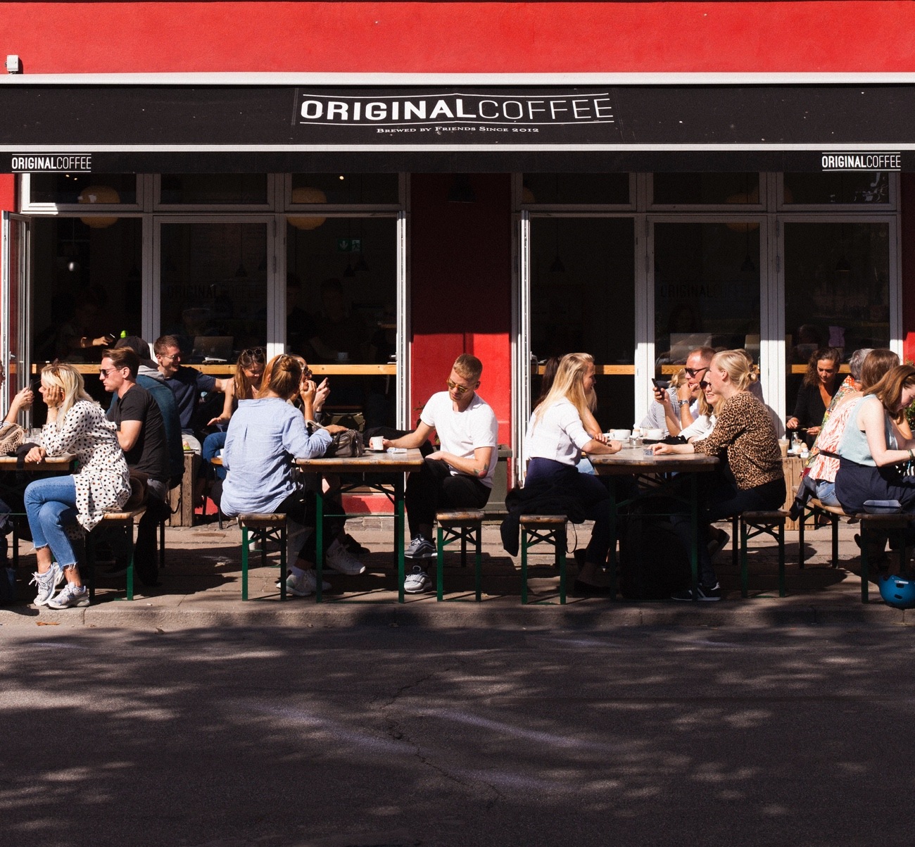
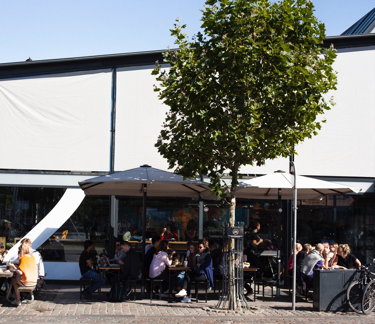
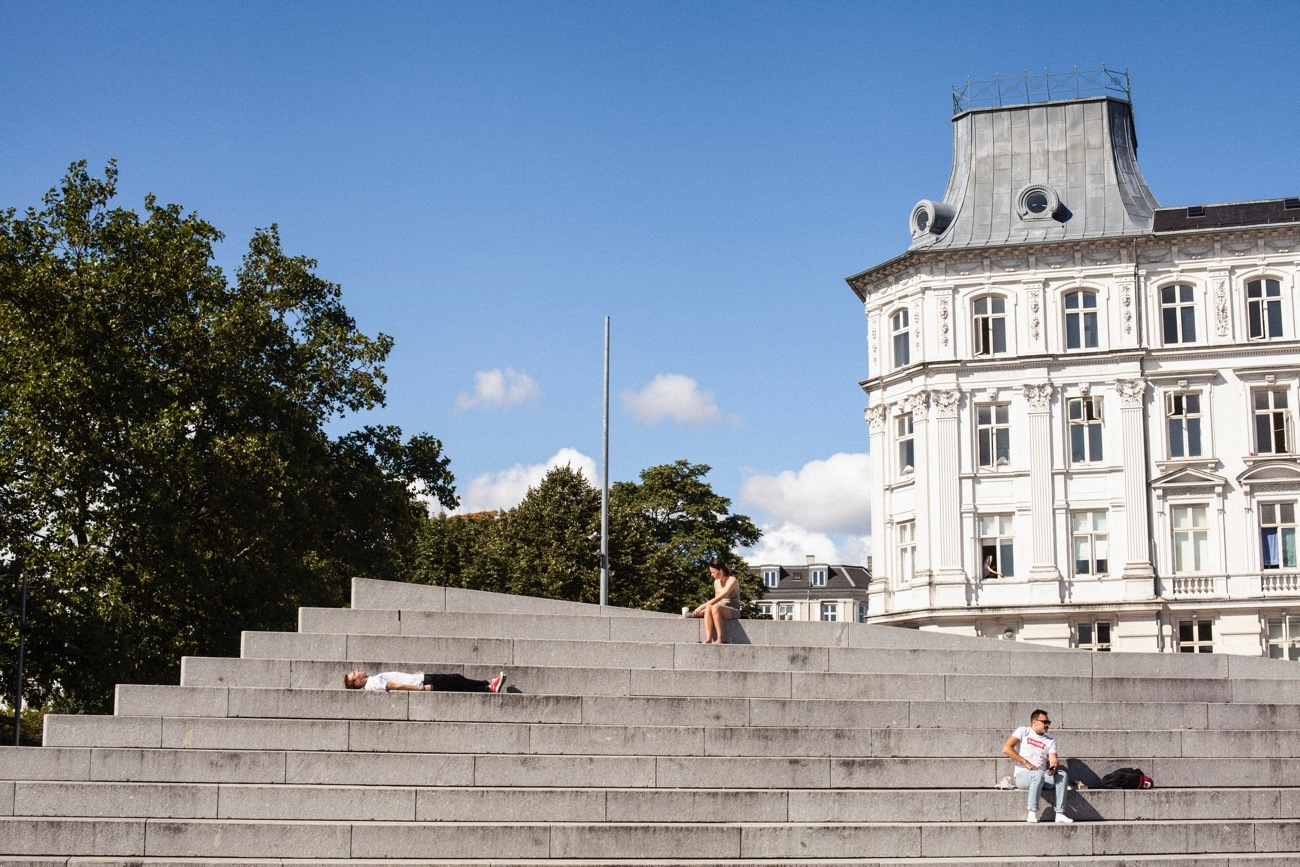
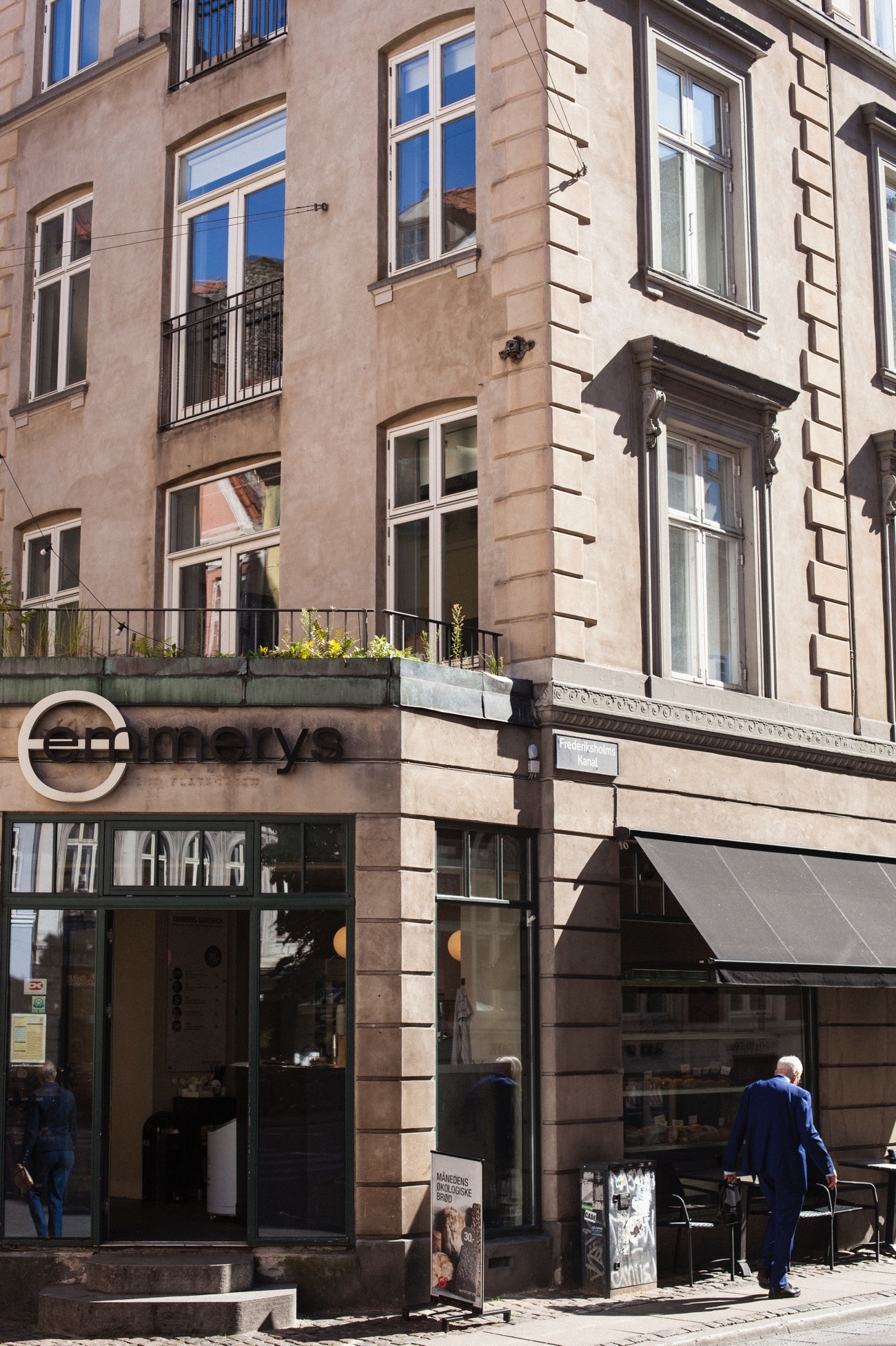
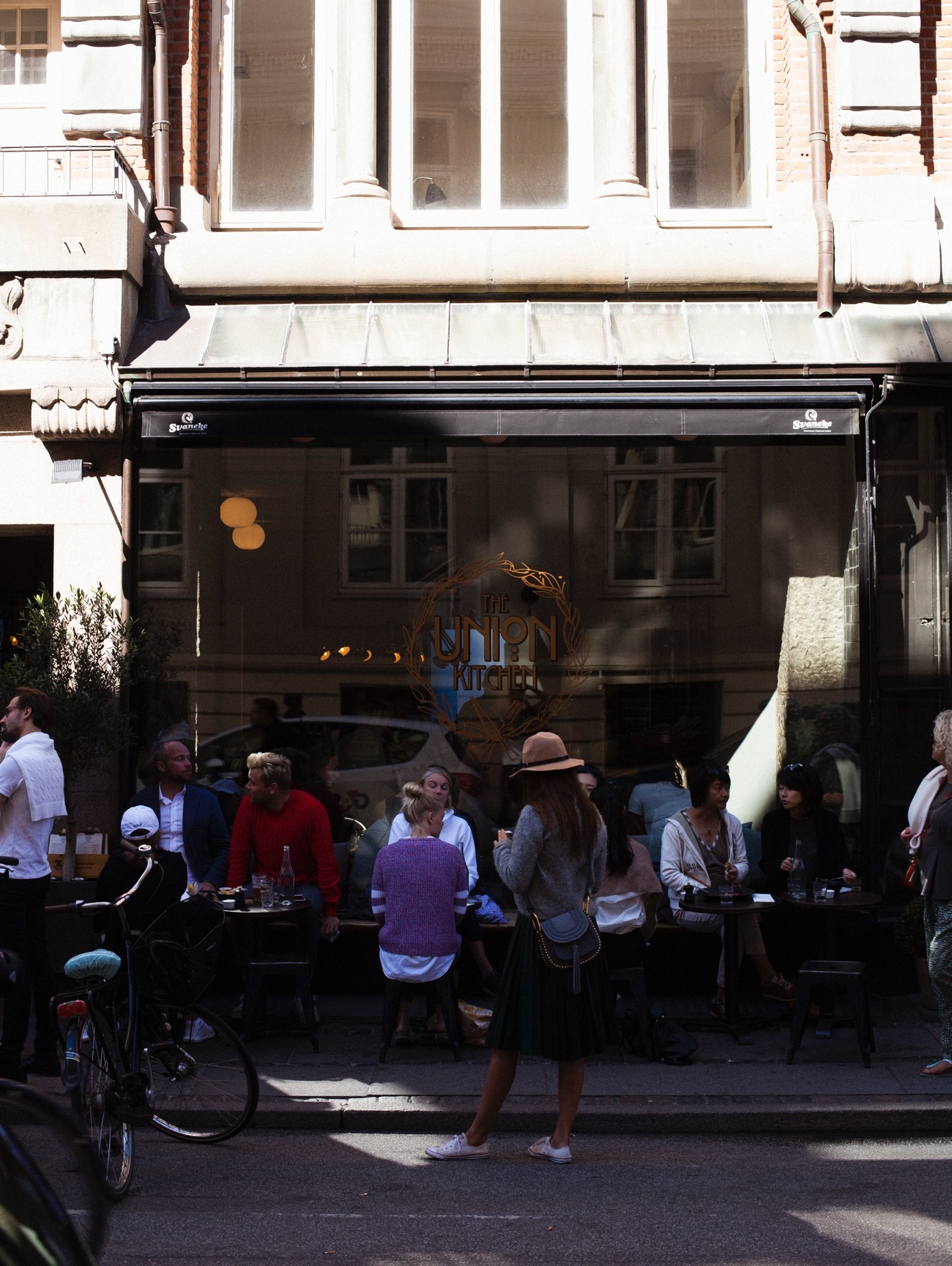
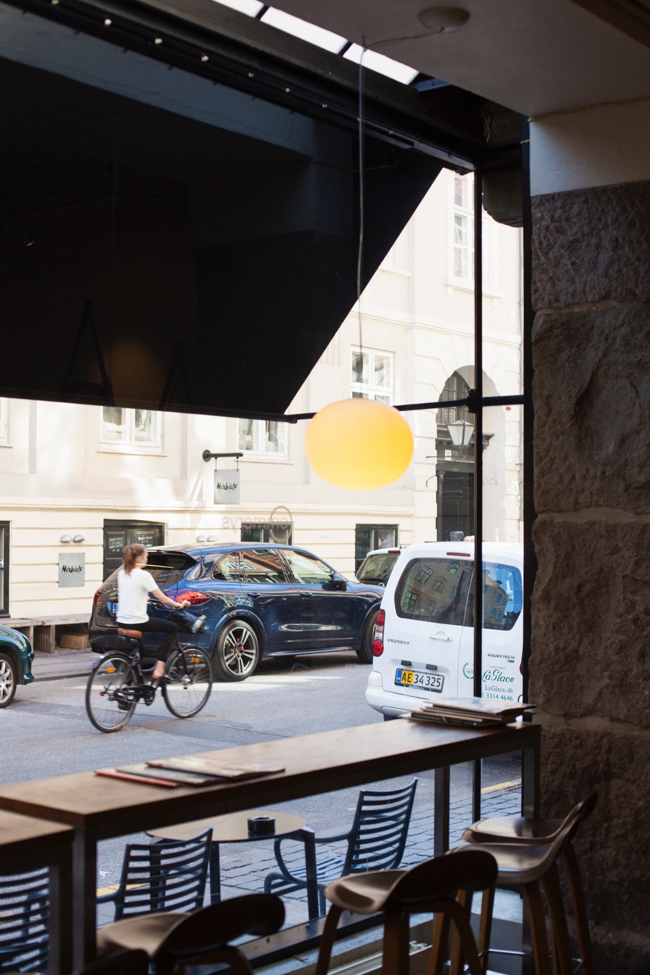
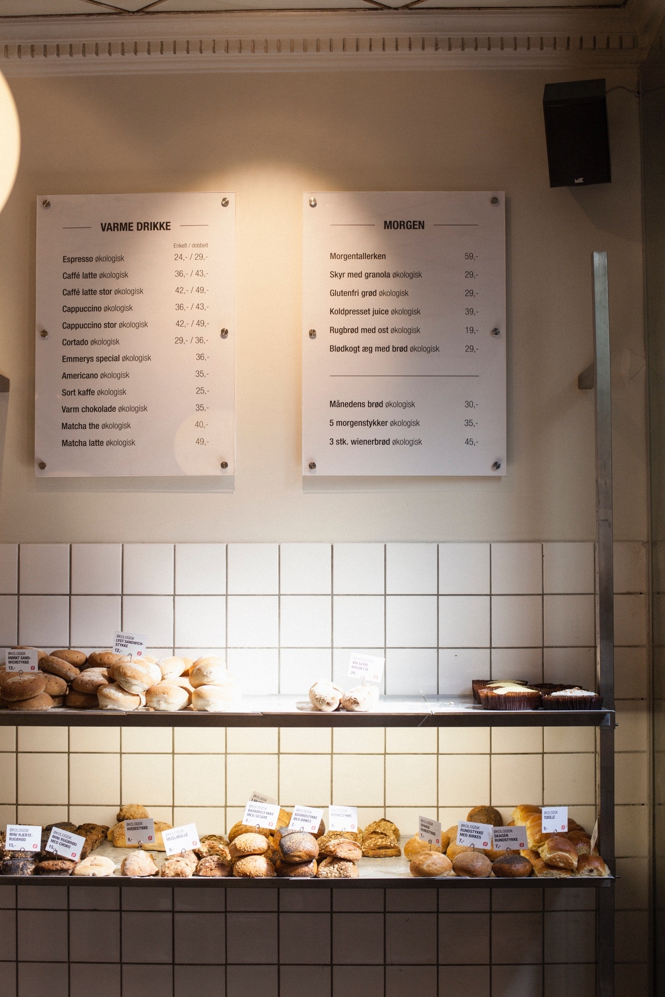
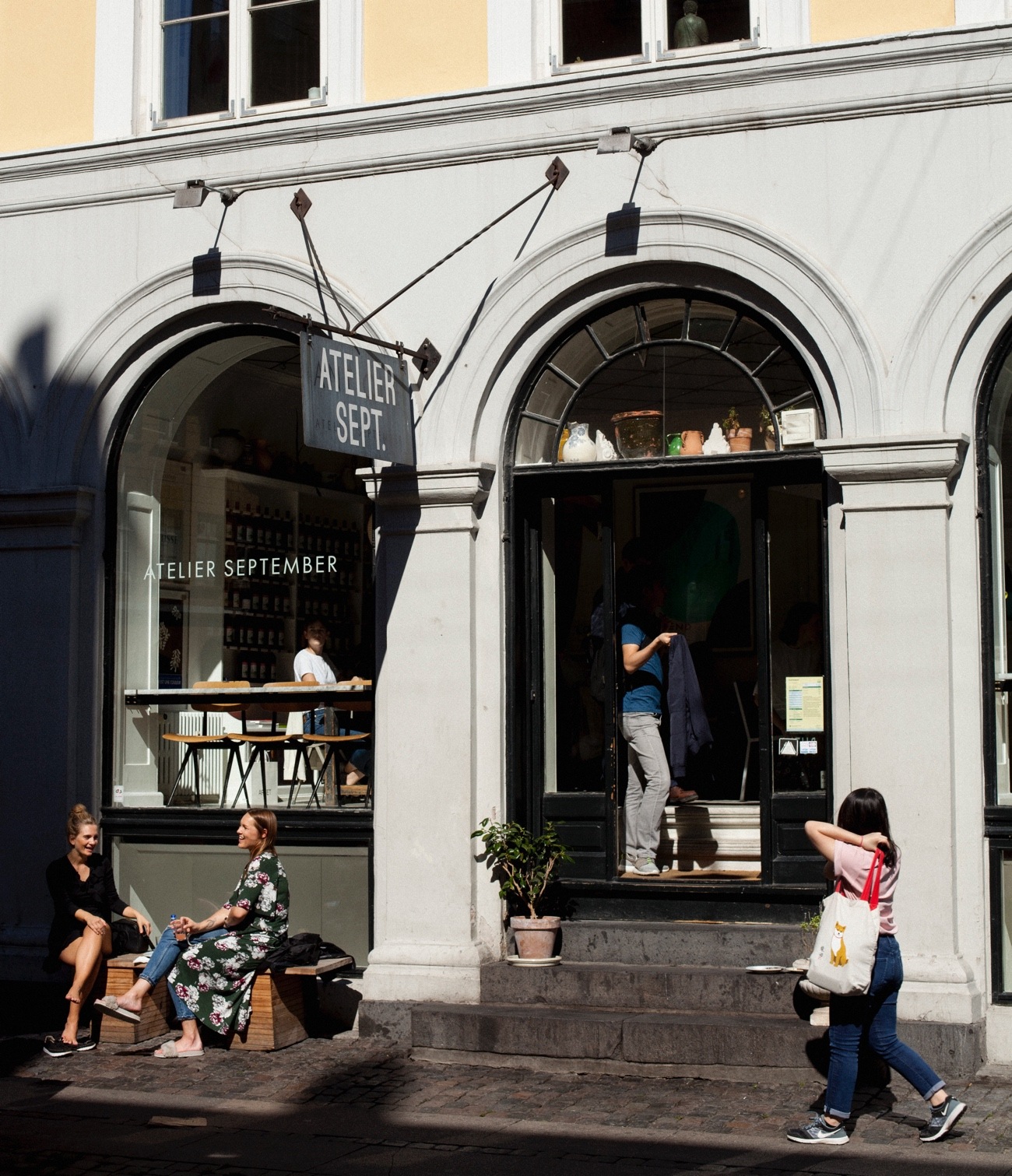
My hardware is pretty standard. A4 paper, Macbook, Thunderbolt display and a Wacom tablet. In terms of physical space, I have a nice little system going on. After I drop the kids off at kindergarten and before I get to the office I normally do like an hour at a coffee shop. I have an intricate system, that has been perfected over the years. I have three possible routes to work, and along those three I have a wide range of coffee shop options, based on weather, my mood and timeframe. With a fixed timeframe, it’s a great time for a loose design session. So whatever I’m working on at the moment, I use that set time to play around and sketch out ideas. Also the small change of scenery every morning keeps the groundhog day feeling at arm's length. I snapped a few shots of my favorite places in Copenhagen during the week.


Where do you go to get inspired?
I think it’s a combination of trying to be observant when I’m out and also doing digital foraging online. I try to keep my eyes open all the time. Taking a new route to work or just being curious when you’re out. Could be a type treatment on a matchbox or an old street sign that sparks something. Also coming from the book and magazine world myself, I tend to pick up quite a few magazines here and there. Print has been around for a long time, so it would be silly not to massage some of the qualities of that world, into the digital products we design.
Also just talking to people with a different perspective is a great way to get inspired. A friend of mine, James Buckhouse, has this amazing ability to flip things on the head and pull the threads of your assumptions. He comes from a background of making art, movies, and writing. We have some fun chats based on random sketches we send back and forth. Talking is always good.
What product have you recently seen that made you think this is great design?
I’m a long time fan of the Square Cash App. They make it look easy, but getting to that level of simplicity is hard work.

Not digital, but still a product - The New York Times Magazine keeps me in awe. The covers are just getting better and better each time. Amazing freelance design work and also art direction by Gail Bichler.


Might be old news and not a product, but that intro to halt and catch fire. The music by Trentemøller and those credits set in Bembo against that 80s red/pink universe… must have watched that intro 200 times. Perfection! And the Muji Hut - I need that in my life.
What pieces of work are you most proud of?
Last year I wrote and illustrated a book for my son about a guy called Manfred who can’t sleep because he has too many questions. Illustration is not my jam, so it took a while to find a working path to something that works. Everything is basically squares and circles and basic shapes. I think it works. Had a lot of fun doing that, and felt great to have the user so close in the process.


What design challenges do you face at your company?
When I joined Vivino we had less than 1 million users and today we have more than 25 million. So being able to quickly scale our designs is something that was tricky in the beginning. We’ve gotten a lot better at that, but maintaining style-guides, a consistent look and feel and being in sync across the team is something we’re still very focused on.
What attracted me to Vivino was the bridge we’re building between a physical object and all the digital layers we can add around it. So when you use Vivino at the supermarket or the restaurant, you’ll have the ratings and reviews from more than 25 million users help you make a decision. A natural next step is getting better at recommending wine and we recently launched a big new feature called Vivino Market. Basically, it’s a combination of our community and almost all the wines on the market, finding you the best wines at the best prices. The challenge in terms of design is, whenever you add commerce to any community, you really have to keep your eyes on the ball - in our case the community. We want our users to drink the best wine possible, and without any markup, we can be quite unbiased in recommending the best wine. But communicating that is tricky and leads to lots of interesting discussions across the team.
What music do you listen to while designing?
Any advice for ambitious designers?
I started out designing books and magazines. And to get better I would just copy the great masters. As in literally dragging book covers and entire page spreads into InDesign or illustrator, and try to recreate it. When I shifted to doing more digital work I did the same. Not sure why, but the act of copying is a great way to question your own assumptions, of what works and why it looks good. A way of training your eyes and adding muscle memory to the decision process. Ira Glass has this great piece on how, when you start out in the creative industry, you are able to see why something works and looks good, but you can’t create it yourself. Closing that gap is insanely hard and takes a lot of time and practice. Just being aware that the gap exists, I think can be helpful.
In terms of process I have a loose structure I follow:
When I start a new design, small or big, I open a blank TextEdit document and start writing out, what I want to achieve with this design and how I plan to do it. Just spending 10-15 minutes having that conversation with myself helps me a lot. After that, I open an illustrator file with 8-10 artboards and start to structure my presentation. Just to get a hold of the narrative and create a red line, before I start on any visuals. Then when I get lost in the process, and I do that a lot, I tend to go back a look at that file, and see if I can find the gaps. Find a core, one strong simple story, and work from there. And only tell one story at a time.
I Sketch and then I sketch some more. There’s this amazing Danish artist called Per Kirkeby. A few years back I watched a documentary on his process called “Pers metode”. The interviewer is following him in his studio while he paints a large format oil on canvas. Over a long period of time, the interviewer notices that he’s spending a lot of time in the lower left corner of the canvas. One day he’s painting a small house and the next he covers it to paint a small forest and so on. Suddenly one day he covers the whole thing with a few thick brush strokes, in a light shade of brown. The interviewer ask him why. “That space needs to be empty, but I had to earn that decision” I love that. So when you sketch, try out as many different directions as possible. That way you get an informed way of making decisions. The two words “What if..” can be quite powerful and a good driver of any process. I try not to fear decisions. I remind myself that decisions are my friends. Facing them can be paralysing, but if you do the work and make informed ones, they tend to drift off into the horizon like icebergs in the Arctic.
Lastly, I try to end the day in a good place. It’s better to stop 30 minutes early or keep going for 30 minutes longer, and have a nice relaxing evening, instead of stopping mid problem and spending the rest of the day being frustrated. Same goes for Friday to Monday.
I think my best advice is to study the masters. Agencies like Pentagram and Chermayeff & Geismar & Haviv have an insane body of work. It’s more brand than digital, but good design transcends that gap. A designer I admire a lot is Mackey Saturday. It made me happy when he joined CHG. If you look at the logo he designed for Oculus, and some of the older stuff CHG did, there’s a clear line between the two. Simplicity never goes out of fashion.
Anything you want to promote or plug?
If you think designers should code, my friend Rik is doing a great job building SuperHi. I’m slowly working my way through his course and book. I know my way around the inspector tool, but learning to code is definitely my next big to-do. And for that, Rik is your go-to guy.
Also that book I wrote for my son I mentioned earlier. I’m working on expanding that to a fun digital project. If you follow along on twitter I promise to keep you in the loop and probably ask for your help soon.
I’m @aweiland on Twitter.


