What led you into design?
It took me some time to find what I wanted to do. When it was time for me to choose a school, I enrolled in a general course giving a broad approach to multimedia. I learned a bit about computer programming, front-end (html/css/js), graphic design (both print and digital), sound design and even a few courses around screenplay and video production. Over these 2 years, I started developing an affinity for everything “communication” related in the broad sense of the term. Just like my math skills, my coding skills really weren’t anything to brag about and I found myself more attracted by the more creative part of the multimedia world.
Finishing school, I was still a bit lost and since there wasn’t a lot of choices where I was living at the time, south of France, I enrolled into a new school teaching “multimedia management”. I only realized this later but it was the French version of a Project Management school, which was a novel concept in my country at the time.
This program lasted three years. The classes would alternate with an internship in whatever company would accept us: 6 months at school, 6 months in the “real world” over a year, alternating each month.
These three years were extremely useful in a very unexpected way. I first discovered that I didn’t want to be a project manager. Instead, I was spending my time doing all the design work I could find during our school projects, “hiding” in a way, enjoying the individual contribution part of the job more than the project management part. I also learned that there’s no place like the real world to learn a job. The school was good for theory but my assumptions and certitudes were rapidly challenged by the imperatives of real-world situation and clients.
As I approached the end of school, I had spent a lot of time studying design execution and met people through my work that would help me grow as a designer by trusting me on a wide range of projects. From graphic design, print design, brand design to web design. I was lucky enough to test it all out and make myself an opinion of what the work entailed. I started working a lot, cumulating daytime job and freelance at night, not counting hours.
What does a typical day look like?
I wake up pretty early to keep my commute as short as possible. I also tend to be more efficient in the morning as my brain is fresher and as there’s usually few meetings. I’m an individual contributor at Google, which means I spend a lot of my time designing and talking to my peers and fellow engineers on project related things (versus managing people for example). I spend most of my time in Sketch but I’ve been enjoying prototyping more and more using a tool called Protopie.
The rest of my time is spent in meetings and interviewing potential candidates for Google. I’ve been quite involved in the recruiting process and it’s really good to be able to look at a large sample of design work made by designers from all over the world.
What’s your setup?
Unfortunately, I’m not able to take a picture of my setup at Google, I did, however, include some public pictures of some of our offices around the globe. I’ve been to a few such as Tokyo, London, New York, Chicago and they are quite something to see.
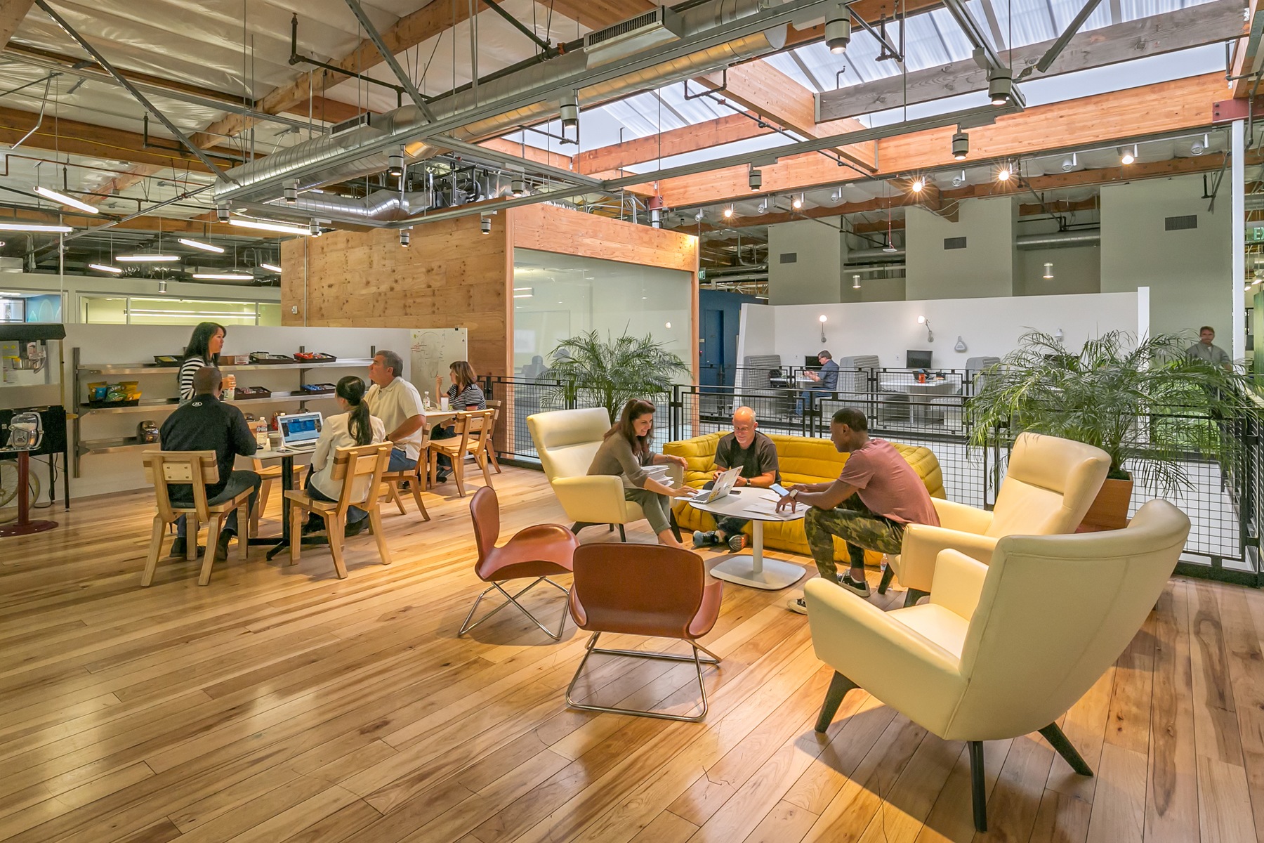
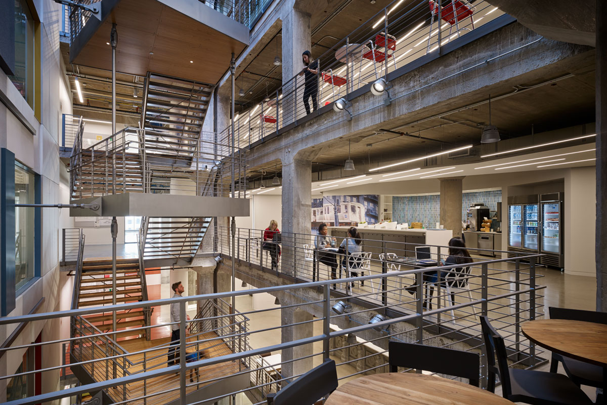
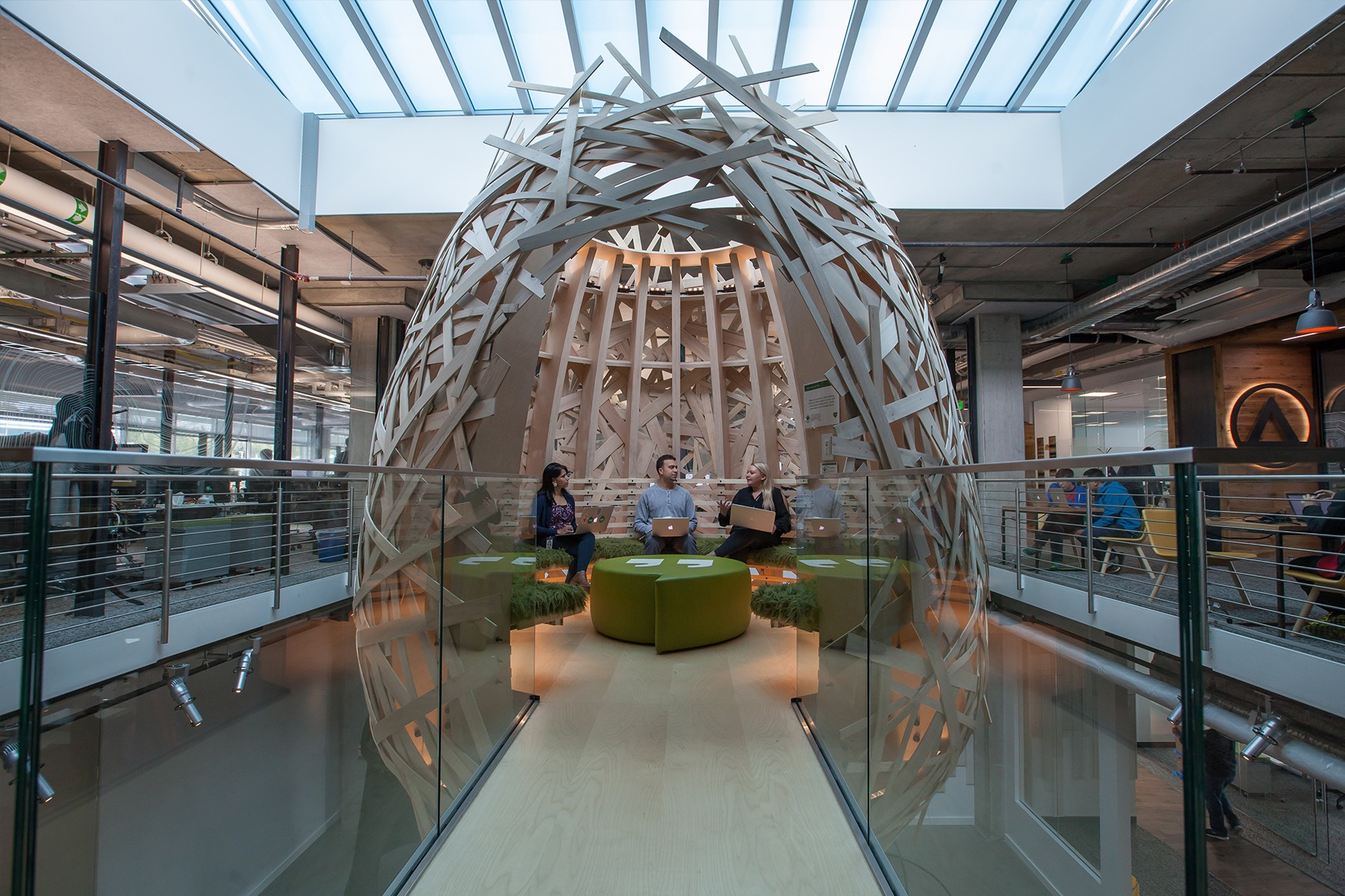
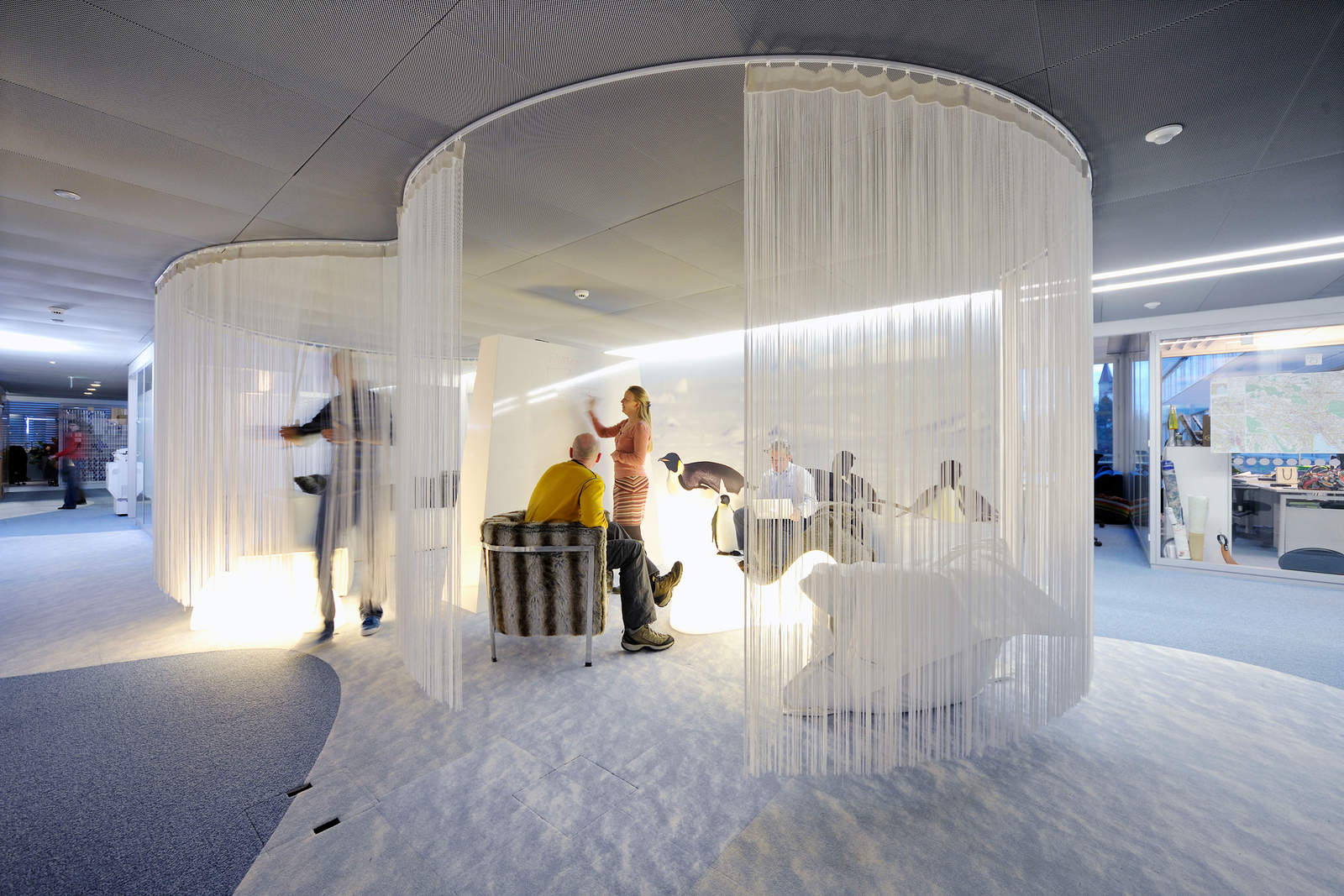
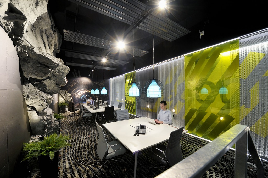
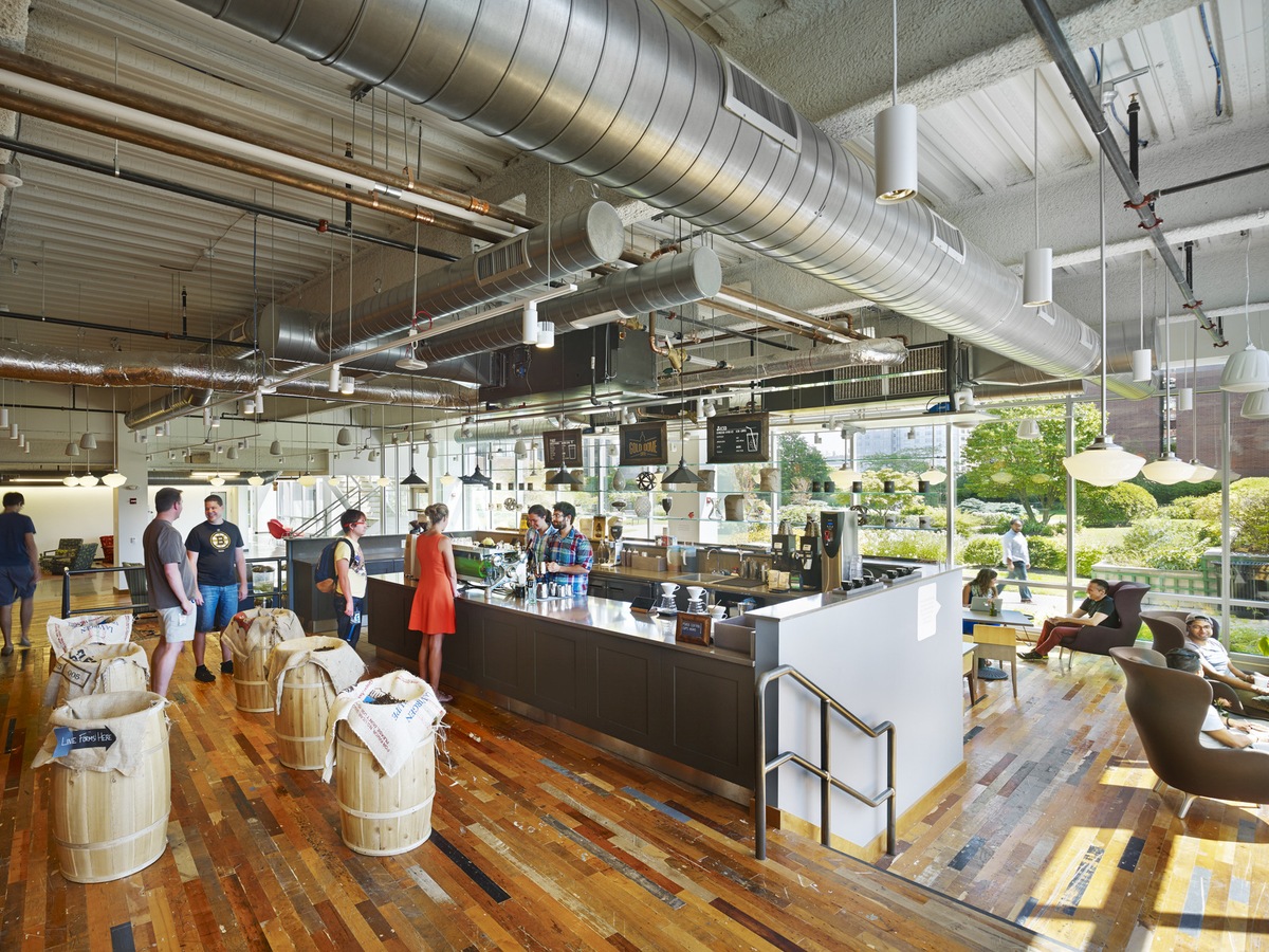
As for what’s on my desk, it’s nothing special, a white desk with a cinema display and that’s pretty much it. I’m quite minimalistic and I hate clutter. In terms of the machine, I have a Macbook Pro and I always carry a Chromebook with me, which always has the latest daily build. I often take my Canon 6D whenever I go someplace new. I also carry two phones, a Pixel XL and an iPhone 7. Apps I use the most on both (as I cannot send a screenshot of my Pixel build) are Chrome, Spotify, PocketCasts, Citymapper and Google maps, Twitter, Google photos, Inbox and instagram/VSCO.

Finally, I also carry a notebook that I use as a todo list and as a way to write down some thoughts. I find the process of thinking and writing tasks on a weekly basis to be a good way to reduce cognitive load. It’s freeing.
Where do you go to get inspired?
I use a combination of digital things. As I grew mostly based on digital resources, my knowledge about physical like books or graphic magazine is pretty limited. Over the years, however, I gathered a lot of sources of inspiration that I often come back to. I use a combination of Feedly + organized bookmark to get the info and news I need. Among the ones I check the most are:
- Dribbble
- Sidebar
- It’s Nice That
- Fubiz
- Behance
- Designer news
- HeyDesigner
- My general twitter feed.
I also periodically check “library” sites that gather good links for various design resources and tutorials across the web. Sites such as designcode.io/learn and seeseed.com. Finally, I used this tool called Inboard that captures and collects websites for inspiration sakes and also sync's with your Dribbble likes.

What product have you recently seen that made you think this is great design?
While I can dissociate good design from good product, I can only think of a great product when it delivers a great design while elegantly serving a solution. I have three products in mind for that:

- Project Fi: When I switched to Project Fi from T-mobile, I was really impressed by the length at which the team went to simplify every step that is usually so painful and confusing with switching carriers. The process is simple, step-by-step, looking nice and more important, empowering. You never feel like you are getting tricked or have to read a 50-page contract to understand what you are getting into. Their transparency and efficiency at every step is an impressive feat.

- Wealthfront: Investment is not something that is easy to pick up. There are a lot of risks in it and it requires a lot of knowledge as well as a good amount of research and assessment. It can be a quite stressful endeavor and I think that the Wealthfront approach, no matter how you feel about automated investment and diversification, was very good. From the core of the product itself to the way it is explained and visually works, I think they really hit the right spot, simple UI that delivers the right amount of information at the right place for the user to feel in charge without being burdened.

- Discord: This product went from a very “Gamers” oriented chat and voice platform to something really big and used similarly to how Slack is used. The way they positioned their product, as well as the ease of use and the incredibly polished visuals, make Discord stand out for me.
What pieces of work are you most proud of?


The first thing that comes to mind is my work on the Chrome Browser. Two years ago we shipped the redesign of the Chrome browser for the desktop for macOS, Windows, ChromeOS and Linux, I talk about it in this article. Since I started UI design, I was always wondering how designers were designing for the software I was seeing on Windows and Mac. All these “native” software that we’ve been using on the desktop platform and that I’ve always used since I was little without really understanding the work behind it. Not every designer gets to work on such a large scale product such as Chrome, especially on desktop platforms, our focus being so much on mobile lately. When I started working for Chrome, I learned a lot about this world and what it meant for a designer to work within its constraints. After around 3 years I got to redesign the browser itself and get to know its interface in its tiniest little details, I’m proud of that.

I also worked on the Chrome browser for Android, I wrote another in depth article about that. Both it and the Chrome browser on desktop totalize 1 billion users each. This is quite a mind-boggling reach and I’m glad to have had the opportunity to work on these. This was almost 4 years ago and now that the team is working towards revamping it. This might be one of the last times I get to brag about it.


More than a year ago, I switched from the browser to be a fully dedicated Chrome OS designer. We’re doing a lot of things on the Chrome OS side. The platform is moving forward at an incredibly fast pace and we’re committed to providing great products to our users. We're a prominent platform in education (K-12) and I’m pretty proud of that.

One final thing, still browser related, is the “Lonely T-rex” we display on the offline page of Chrome (you can also access it online by typing chrome://dino in the URL bar). It started with a little joke but really blew up into something I wasn’t expecting. When I designed the iconic T-rex, I thought it would just make people smile and move on, but stories around the reasons behind its existence, often much better than the truth started popping on the internet. It really took off when we worked on the game though and now I can see T-rex everywhere around campus, at Google I/O, in memes, in real life, some people even tattooed it on their skin (no joke). You wouldn’t believe how many people play it per month, I’ve always wanted to work in video games, and in a way, I sort of did.
What design challenges do you face at your company?
I’m guessing this is not inherent to Google but pretty much part of every large company struggle: working across teams and synchronizing efforts is one of the hardest tasks. It takes a good designer to design a solid interface that looks good and works as intended, but it takes a great designer to do this with multiple stakeholders that might not have the same goals or bottom line as you do. I have to say, I’m not quite that designer yet. It takes great communication skills and a sense of diplomacy and politics that is not given to anybody. You know that question which at this point turned into a meme in the design community, "Should designer code?" I think it should actually be, “Should designers product manage”? As our role evolves out of purely technical considerations, the future of design might not be in one's ability for coding, but one's ability to unify various opinions and objectives around one vision, through whatever medium of your choice.
What music do you listen to while designing?
Any advice for ambitious designers?
Be careful about the vision of design we the design community created for ourselves. We’re at the intersection of creativity and technology, we are communicators as well as technicians and sometimes we tend to glorify our role, telling ourselves stories about who we are and what we should be.
The whole concept of the designer is in constant evolution. It’s a fleeting and moving target that is very hard to appreciate. Finding your niche where you fit will help you way more in your career than trying to replicate other people’s solution or conception of your role. Deciding yourself what a designer should do is a good way to approach your career in my opinion. Balancing the idea of what a designer should do and then be measuring it to the expectations of your current role is a good way to appreciate what you need to do, modify or change in the future.
Also, don’t underestimate the value of staying one’s course. Persistence is an important quality, in every job.
Anything you want to promote or plug?
We are looking for designers and more specifically Senior UX designers for Chrome OS. If you think you might be a good fit and are interested in the team, you can apply here or reach out to me directly.
If you want to connect with me, the best way is usually Twitter but you can also drop me an email at sgabriel.contact[at]gmail.com. I also often share some pictures on Unsplash, if you’re interested in that kind of thing.


