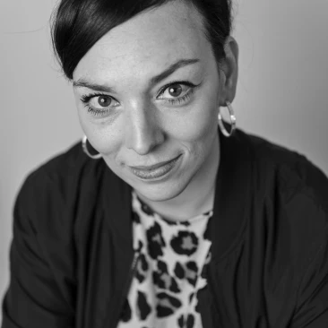
What led you into design?
Graphic design and letterforms have always attracted my curiosity. When I was a child, I was very quickly interested in the numbers on the back of football shirts, as well as the whole graphic world of this sport, such as club crests or Panini albums. I think that's what led me to graphic design. This interest in letters naturally led me to graphic design, then later to typography.
It was at the HEAD-Geneva that I decided to make typography the central element of my work. I quickly felt limited in my practice as a graphic designer, and therefore wanted to be able to create my own typography to expand my playground. I decided to fully immerse myself in type design by joining the ECAL Type Design Master, where I graduated in June 2021. Since then, my interest in typography has not stopped growing.

What does a typical day look like?
Being both a freelancer and a teaching assistant at the HEAD–Geneva, my days are very different from one to the other. There is no such thing as a typical day, but I would say that there are recurring elements that punctuate the day. I start my day with a bike ride to the office at 9.30am. I need a lot of organization, so I always start by making a to-do list and tidying up my workspace.
Then I choose a good playlist or podcast to listen to, and off I go! I take a short break around 12:30 to eat and get some fresh air, and I'm back to work by 1:30. I usually work on two projects during the day, one in the morning, one in the afternoon, which allows me to keep a fresh eye on my work.
What's your workstation setup?

Where do you go to get inspired?
My influences are very diverse. I am instinctively inspired by typographic elements of everyday life and the emotion they give off, such as vernacular typography on random signs in the street. For example, I am impressed by the banners made by Italian football fans in the 70s, and the energy they give off. I find it very rewarding to see the different typographies in different countries and times.
Herb Lubalin's work is very inspiring because of his strong visual ideas, his ability to make words images and the direct relationship between typography and its context. I am also very interested in more experimental projects that mix different techniques. I'm thinking of Karl Nawrot's work and his experiments with the typographic form, or Takenobu Igarashi's typographic sculptures.
What product have you recently seen that made you think this is great design?
The short film directed by Félix De Givry for Muddy Monk's Ultra Dramatic Kid album has been very appealing to me lately. The mix between the film images, the 3D effects and the music plunged me into a singular and poignant universe.
What pieces of work are you most proud of?
My typeface Tifo, which I designed during my Master's degree at ECAL and continued to develop afterwards to release it on 205tf type foundry. Tifo is inspired by the lettering on the banners waved by the most fervent tifosi at football matches, which were born in Italian stadiums at the beginning of the 70s, showing support for their favourite team with banners, chants, and smoke.
I developed this typeface by closely observing the tifosi fanzines of the seventies and eighties. Each variant corresponds to a different style of lettering. Some "oddities" visible in these vernacular sources – which could rightly be considered typographical errors – have been deliberately retained. They give the Tifo a singular and authentic character that is part of the long tradition of typical Italian public lettering.
The five styles of the Tifo share the same skeleton, but each one “defends different colours”! With a geometric construction and a design reduced to basic shapes, the Roma (square counterforms), Venezia (straight outline and circular counterforms), Bologna (outline) and Palermo (stencil) styles are four resolutely titled versions, designed for use in large bodies.
The Milano style, whose design is as close as possible to the family's skeleton, is a versatile version, suitable for both headline and running text composition. All styles share the same proportions, allowing graphic designers to easily combine the five versions in their compositions.


Another project I find interesting is the typeface Teta. It is a display typeface inspired by the works of the German artist Bettina Pousttchi. Bettina Pousttchi’s work is composed of abstract structures, creating vibrant and dynamic forms. This typeface recreates a similar world through the rigid construction of the letters, the irregular contrast and the tension around the lines.


What design challenges do you face at your company?
The most difficult thing is maybe to find a good balance between freelance projects and the assistant work at HEAD-Geneva. Sometimes several important projects can happen at the same time between my two practices, which can be very time-consuming and complicated to manage. I think it's really significant to take time for yourself and understand the importance of disconnecting from work at times.
What music do you listen to while designing?
Any advice for ambitious designers?
Get away from the computer as much as possible and be curious about the world around us. Don't forget that technology is a tool like any other. It must be at the service of design. Design should not be crushed by technology.
Anything you want to promote or plug?
First, thank you Lovers Magazine for the invitation! And don't hesitate to get in touch for any typeface or collaboration.
@romain.trnc


