What led you into design?
In hindsight, working in design feels almost inevitable. I had two dominant interests growing up: drawing and computers. When asked what I wanted to be when I grew up, the answer has always been an artist. During middle school, like all good millennials, I was internet-obsessed. I spent my summers on Neopets, Myspace, and learning to code on Geocities.
I continued to foster these two interests through school, studying Art and Art History in college. Initially, I wanted to pursue more traditional art mediums like painting and drawing but struggled to find meaning in the work. It wasn’t until I explored more graphic mediums that I realized how much I enjoyed leveraging art as a tool for communication. I loved the collaborative nature of those projects and seeing the direct impact that design could make.
For that reason, I’ve always been interested in communication and brand design. Those experiences, coupled with my technical background as a front-end developer, have drawn me toward working on digital experiences that tell the stories of brands and products.
What does a typical day look like?
Coffee first, usually followed by a podcast of Fresh Air or The Daily on my commute into work. I try to get into the office early while it’s still quiet for some uninterrupted design time. I find it easiest to focus in the mornings so it’s the best time for more expansive types of creative ideation. Later in the afternoons is my preferred time to schedule meetings and have collaborative brainstorms.
After work, I try to squeeze in time for exercise, either by running in the Panhandle or at N’Motion Fitness, the women's weight training class by my house, with Coach Charlie.
Otherwise, I’m usually making my way through a contemporary fiction novel. Some of my recent favorites have included On Beauty by Zadie Smith and Lincoln in the Bardo by George Saunders.

What’s your setup?
In June of this year, Gusto moved into a beautiful new office in the Dogpatch. The team renovated the historic Pier 70 into a beautiful and functional space that maintained the buildings’ historic personality while retrofitting it to meet the company’s needs. Some of my favorite features include the design team brainstorming room, the Donut Factory, and the terrifying 50-ton crane that’s affixed to the ceiling of the warehouse. Read more about the process of designing the space in this post by my colleague on the Brand Studio team, Jenna Carando.


Breaking the designer cardinal sin, I’ve prioritized form over function by organizing my apps by color. It’s a counter-intuitive system -- the result of a decision I made on a whim a long time ago. ¯_(ツ)_/¯


My computer workstation has most of the usual suspects: Creative cloud, Sketch, Figma, and front-end development text editors.
Where do you go to get inspired?
I’m constantly inspired by things I find on the internet. Designs shared on Slack, Twitter, Pinterest, competitor websites, and other designers’ portfolios. For me, the best place to house all these disparate pieces of inspiration is in Chrome bookmarks.
When I see something inspiring or something I’d like to reference for later, I save it in a bookmark folder. When starting new projects, this is often the first place I go for inspiration.

What product have you recently seen that made you think this is great design?
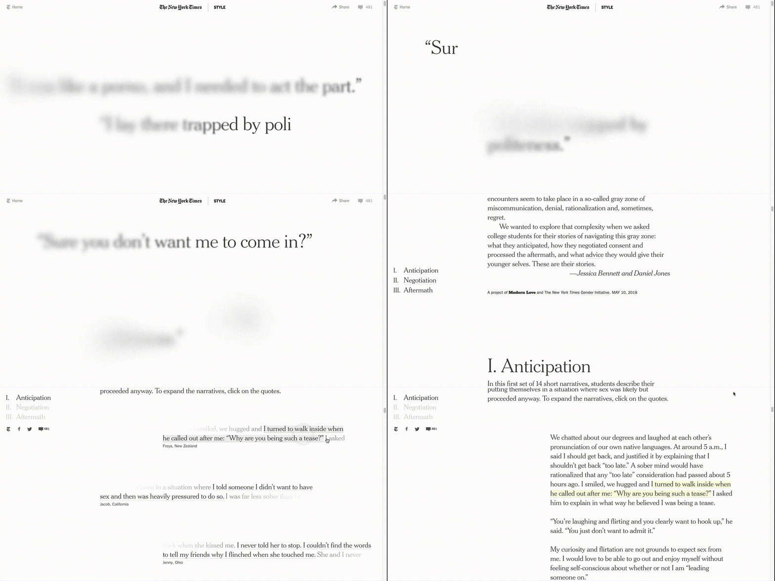
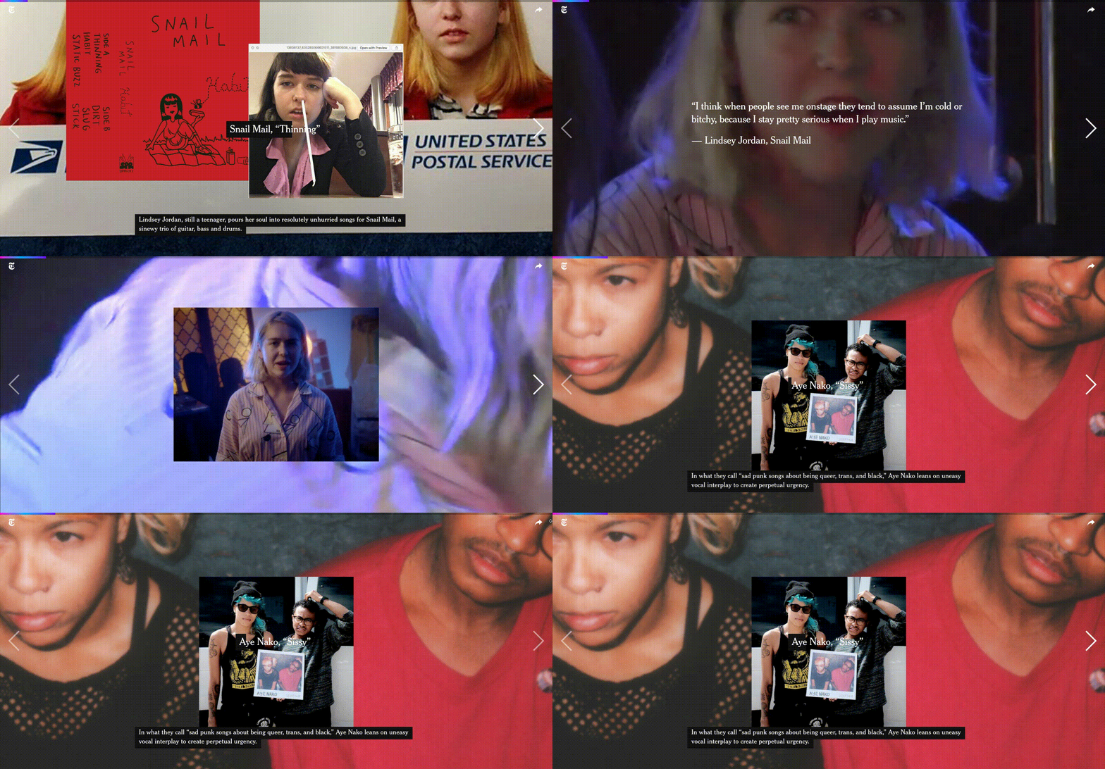
I’ve been really inspired by the interactive experiences coming from the New York Times graphics department. These bespoke projects really capitalize on the multimedia possibilities of storytelling on the internet. They incorporate graphics, content, music, animation, and interactives to enhance powerful stories into visceral experiences.
One of these pieces was 45 Stories on Sex and Consent on Campus, which crafted a mosaic narrative from the first-hand accounts from individuals dealing with sexual encounters on college campuses. The editorial decision to obfuscate and obscure the quotes mirrors the haziness and secrecy that often enshrouds these events. I thought it was a beautiful example of a product's functionality mimicking the intention of the content, rendering the piece more engaging and salient.

Designed by Umi Syam and Tracy Ma
Another piece I really enjoyed was 25 bands that prove women are making the best rock music today. It creates an experience for the user that allows them to simultaneously explore the work of talented musicians while also providing clues about their backgrounds, personalities, and influences. It layers photography, content, and audio and has accompanying cross-platform content on Spotify and traditional long-form New York Times content.

What pieces of work are you most proud of?
I recently had the opportunity to redesign Gusto’s careers page. Designing a page for a company that helps other businesses build great places to work was a fun challenge. I had the opportunity to work closely with the People team, engineering, design, illustration, and photography to build a page that both met the functional requirements but also showcased the company’s unique culture and brand.


I worked with Colin Price, a talented Bay Area photographer on a photo shoot of the Denver and San Francisco Gusto offices. I also collaborated with Jenna Carando and Camellia Neri on a series of community badges for our internal groups at the company.

What design challenges do you face at your company?
One of the unique challenges that the Brand Studio team faces at Gusto, is how to build a brand that shows personality while maintaining trust. As a company that processes millions of the dollars in payroll every month, it’s important that individuals feel confident that our brand can deliver on these exchanges. However, at Gusto, we also want to personalize and humanize an industry that has historically engendered frustration, tedium, and pain. It’s a point of differentiation that makes tedious tasks easy and sometimes even delightful.
Similarly, when building for HR, we’re building experiences that must handle the wide emotional spectrum of events that happen within a workplace. Everything from the exhilaration of receiving a job offer to the seriousness of terminating an employee or notification of heavy compliance fines. Our team is looking to build a brand that’s flexible enough to accommodate that spectrum of experience while remaining authentically ourselves. In finding this balance, we try to remain judicious about when and how to administer brand personality.
What music do you listen to while designing?
Any advice for ambitious designers?
Share your work! Speaking from personal experience, a lot of us in the design community are afflicted with rampant perfectionism. While it can feel like a productive impulse, not showing your work until it’s “perfect” can ultimately hold you back. By showing your work, you’re creating the opportunity for feedback and broadcasting to your networks the type of work you like to do and want to do more of. By hiding your work, you’re also denying yourself the opportunity to look back to see the progress you’ve made.
Try to find the overlap of what you love to do and what you’re good at. It’s really normal to be particularly drawn to a part of the design process. For some that’s the early ideation phase, for others, it’s the final pixel-pushing phase. Following your impulses and playing to your strengths can lead to becoming an expert in the design niche that you like the most.
Anything you want to promote or plug?
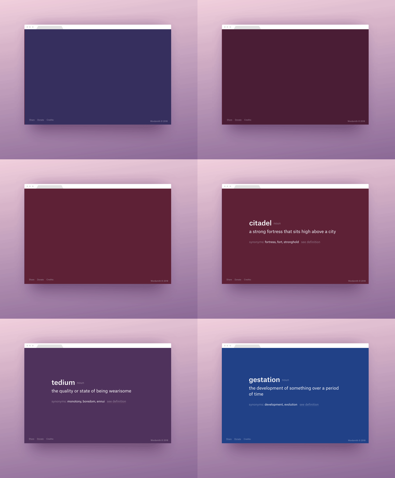
Wordsmith, a Chrome Extension I built with my good friend, Lindsay Grizzard. It’s a tool that replaces a new browser tab with vocabulary words. You can add it from the Chrome Store or read about the engineering behind building it on CSS Tricks.


