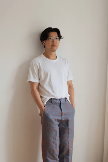
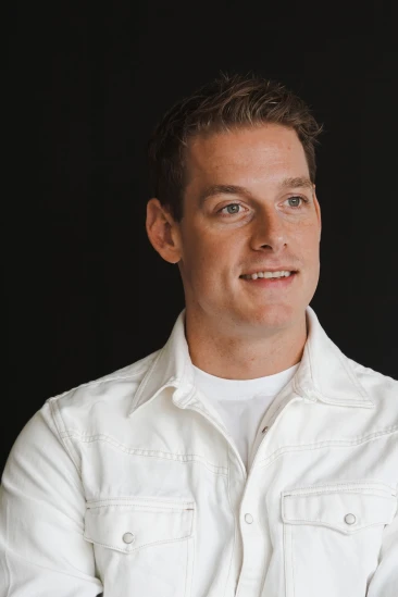
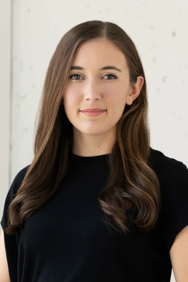
What led you into design?
During my high school years, I gradually migrated towards a more “art and design” oriented life. I remember I used to design a lot of flyers for small parties, clubs, or school events. I downloaded photoshop onto my PC and started messing around every day after school. I would recreate posters that I found in the streets, study the typefaces, colors, and layouts and try to make them look as close to the original as possible.
But the person that really pushed me into design was my mother. She got me my first interview at Hochburg, a branding studio in Stuttgart Germany. At that time I didn’t even really know what graphic design was, how to apply it to complex problems, make beautiful typography layouts yet alone make a living out of it! I fell in love with graphic design on my first day at that studio. The two founders, Fabian and Florian are amazing designers and they took me under their wing for many years. I remember very clearly watching Florian design the brand identity for a new Japanese restaurant that was about to open. I was blown away!
I think I was very lucky that I was exposed to such an intense level of quality and had two extremely talented and tough mentors that continuously pushed me forward. They really paved the way for me in the early stages of my carrier. I’ve said this in interviews before. The best thing you can do is find a mentor and try to follow them, copy them, learn from them and try to hit their level.
What does a typical day look like?
I usually start my day off with coffee, a run along the waterfront in Williamsburg overlooking Manhattan, and then a subway ride to the Squarespace office located in Soho.
Then we all have check-ins with members of the concepts team. We are a fairly small and nimble group and we try to keep our meetings short and get straight to the point. We work on many different projects and adhere to different deadlines so we use this time to catch everyone up on what’s going on. After that, I get straight to work. Concepting, prototyping, and high-fidelity design sprints are always on the day-to-day agenda. We work with a lot of different teams and since we are back in the office there are more meetings that evolve naturally on a daily basis which is always great! For lunch, I like exploring new restaurants around the west village and Soho area. There is always a ton of stuff going on. I end the day around 6-7 pm depending on the workload.
Fridays we usually do after-work beers with the team or other members of the Squarespace org. There are a lot of teams that I interact with on a weekly basis and we usually get together once a week to gossip, share work, brainstorm new ideas, drink a few beers, and play pool!
What's your workstation setup?
Where do you go to get inspired?
Id say New York is one of the coolest cities to live in as a creative. The city is a vibrant and cultural melting pot that is home to people from all over the world. I interact with such a wide variety of talented people, that’s really inspiring for me. My friends all come from different backgrounds and work in different industries. Meeting up, exploring the city together, and discussing our work is very stimulating and fuels my creativity immensely.
When I was younger I would constantly browse Behance, Dribbble, and other websites like Awwwards for the latest trends but these days I try to stay away from that approach.
I try to find inspiration as far away from my computer as possible. Analog layouts in magazines and books, an art gallery with a new artist that is being featured, the MoMA or just simply walking through the city and taking in all the typography around me. I take pictures of everything I see that I find intriguing and cool and dissect it in my lab later, archive it, and then usually it pops back into my head when I’m working on a project and I can apply it then!
What product have you recently seen that made you think this is great design?
That’s easy. My AirPods. Can’t even remember how I lived without them!
What pieces of work are you most proud of?
I’m really proud of the Marcus Erikkson website the concepts team at Squarespace and myself designed. Marcus is a prolific photographer based in Vancouver. He works with high-profile clients and personalities and his photos have a unique and clean style. We designed his new folio with a lot of tiny and subtle details that make the website really fun and simple to use. Layout changes on reload a unique radial index, and a screensaver mode on the intro page that when you leave the site alone turns into a slideshow of his work. Check out the site here
I work on freelance projects from time to time during my weekends and nights and use those projects to grow my knowledge, test out new ideas and bring concepts to life that I’ve been thinking about for a while. I try to really blend my knowledge between all disciplines and projects I work on to get the best possible output and outcome for all future work I do.
I worked on another fun site last year with my colleague and friend Jesper Vos for Centogene. Centogene is a rare disease company revolutionizing genetic solutions for patients worldwide. They approached us with the idea of creating an interactive 3D experience that would showcase the mission of the company in a fun and playful way. We created an immersive world rendered in 3D and brought it to life through Web GL. Users could scroll through the pages and interact with different artifacts on the pages. Check out the site here
What design challenges do you face at your company?
I’m part of the design organization at Squarespace, a website building and e-commerce platform, working on a small team called concepts. We focus on interactive design systems and sit between the Product and Brand teams at Squarespace. One of our challenges is simple, how can we push the boundaries of our product further? How can we make it easier to use, more engaging, and fun and how can we help our users create their best possible digital brand experience for them and their client base?
We also think about the future of the web and how users will interact with websites in the next few years. We have to stay on top of trends, functionalities, and usabilities of websites and feed that back to our users and our own product. Our team is essentially a research and development department that is utilized across the organization to help out on any kind of project large or small. We jump in and out of tasks and focus on our own timelines and goals as well.
There is always a lot going on and since we have a mix of developers, motion designers, 3D designers, product designers, UX researchers, and interface designers on board, there is a high level of collaboration and exchange of knowledge that makes most of our work extremely challenging and unique.
What music do you listen to while designing?
Any advice for ambitious designers?
Work hard. Put in the hours, it will pay off in the long run. Collaborate with people, there are so many wonderfully talented people in the industry. Find people you admire and work with them. Push each other forward and have fun. Oh and take breaks! It’s important to reset from time to time, something I definitely need to get better at myself.
Anything you want to promote or plug?
Ive been working on my new portfolio with Jesper Vos and Yael Bienenstock. Shoutout to those two at this point. I would not be able to create the work I do without them. They constantly challenge me and my work and I’m very grateful for that.
We took a product-related approach to the build of the portfolio. The entire site is built using one variable component. That component has a few variants that are made up of different properties. Using this system, we can create a very consistent look and feel and populate content using instances. It becomes very dynamic and modular which makes it extremely easy to update content and change layouts and hierarchy. This also helps with the development of the site and leads to a very robust back end. Variants are art-directed by myself but for mobile, we generate the content and layout based on the variant that makes up each component. We break down a three-column layout on desktop into an auto-generated two-column setup on mobile. That brings a lot of flexibility and cohesiveness to the site.


