What led you into design?
Growing up I spent most of my time skateboarding, drawing and shooting photos of friends. I learned basic coding practices through MySpace (like many people did at that time) and used that knowledge to make rudimentary websites with Photoshop slices because that’s what the people I looked up to were doing. I didn’t think of it as designing, I more so did it out of the necessity for a place to host the skate photos and videos that my friends and I were making.
Shortly after getting my first camera I sold some photos for ads and won a couple of awards, eventually deciding I wanted to attempt a career in photography. I continued shooting a lot through high school and enrolled in a college in Daytona with a great photo program. Realizing that college and Daytona weren’t a good fit for me at the time, I dropped out after one semester.


After taking a few motorcycle trips, working in kitchens and still not knowing what direction I wanted to go career-wise, I took the recommendation of an advisor and enrolled in a Graphic Design program at a different college in Orlando. Pretty quickly I realized how much I enjoyed it. I had a few great professors that really cared and helped push me to create better and better work.
What does a typical day look like?
A typical day for me starts anywhere from 5-7am where I drag myself out of bed and either run, exercise, catch up on classes I’m taking or design something for fun. From there I either walk or skateboard to the train where I read & listen to music. Once I get to work I’ll eat breakfast in the cafe with coworkers and talk about how crowded the train was or what cool memes we saw on the internet lately.
Post breakfast I spend the morning working on new and current projects, meeting with stakeholders, brainstorming with coworkers, and creating prototypes.
Breakfast repeats itself in the form of lunch where I meet with coworkers again and talk about how many meetings we had or how tired we are.
After lunch, I hope for no more meetings and try to focus for the rest of the day while bouncing between Sketch, After Effects, various Adobe programs, and C4D depending on the day. I try to leave sometime between 5 and 6 so I can get on the train before it gets too crowded. Once home I’ll usually make dinner with my girlfriend and either work on a side project, freelance, or relax and watch a movie.
What’s your setup?


Where do you go to get inspired?
I have a ton of books I refer to regularly, some for the content and some for the layouts themselves.

I also collect images and links of things I find interesting on an app called Dropmark and within my Instagram bookmarks. Some of these are things I was into at a glance which I categorize by month to get a sense of how my tastes change throughout the year and some things I categorize by whatever it was that I was intrigued by (interactions, layout, illustrations, etc.). Some sites I frequent are Fonts in use, Typewolf, Behance, Awwwards, Dribbble, Codrops, Pinterest, etc. I’m also a part of a few great slack communities where we all share resources with each other as we come across them.
When I’m getting tired of screens, I like to read, push around on my skateboard, go on hikes, walk around museums, watch documentaries, and listen to talks by other designers with more experience than me.


What product have you recently seen that made you think this is great design?
With so much great stuff being designed lately it’s hard to pick just one thing. Lately, I’ve really been digging Anxy Mag. The layouts are amazing and the content is even better. I love the way they use color and type to communicate different emotions throughout their articles, creating tension and ease to reflect the content of the stories being read. Their covers are also incredible, utilizing different artists and designers for each and allowing the style to inform the inside layouts.


Grilli Type has been doing great things with their new releases on the web and in print. The landing pages do a great job telling the backstory behind the work, shedding light on tiny details and considerations and overall do a great job showcasing usage in a way that goes far beyond the capabilities of traditional pdf specimens.

What pieces of work are you most proud of?
I’d say something I’m pretty proud of lately is the rebrand work my friend Adam and I did for Abstract that launched last year. They came to us wanting to do something really different with their brand and provided some great mood boards and ideas from the start which was really refreshing. We started the project by taking the provided inspiration and building on it. We assigned keywords to each direction and brought those concepts to life with loose explorations and placed them in context of how they would be used.
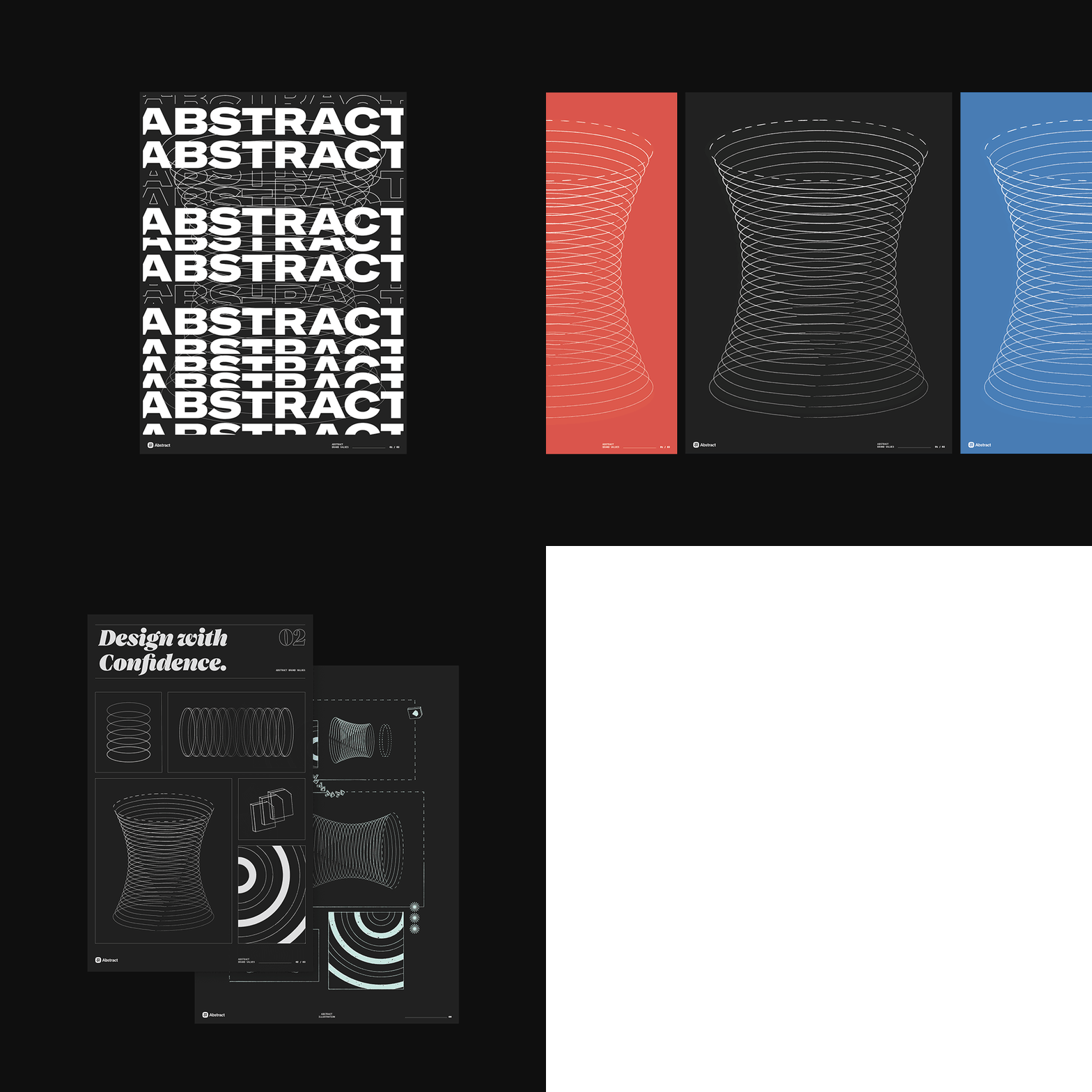
The team at Abstract was great to work with. They provided good feedback, and it was really fun to be able to push their brand as far as we did. We had a ton of creative freedom and pitched some pretty wild ideas. We redesigned the website and almost everything on the brand side, except for the logo. It was received really well and was recently featured on Typewolf as a site of the day.

I’m also proud of the work I’ve been doing at Asana. I’m privileged to work with some of the best illustrators and designers I know, so collaborating on projects is always amazing. It’s hard to pick just one thing from my work here because we release new stuff pretty consistently but I think I have the most fun exploring interactions and making posters on our Riso.
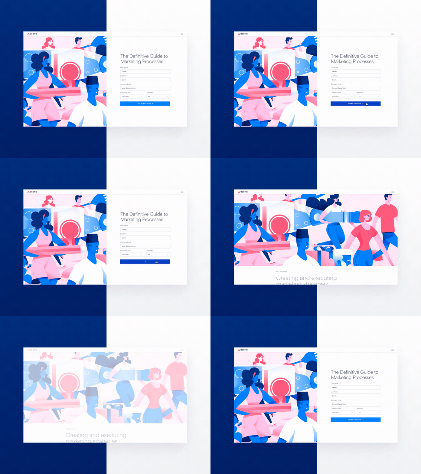
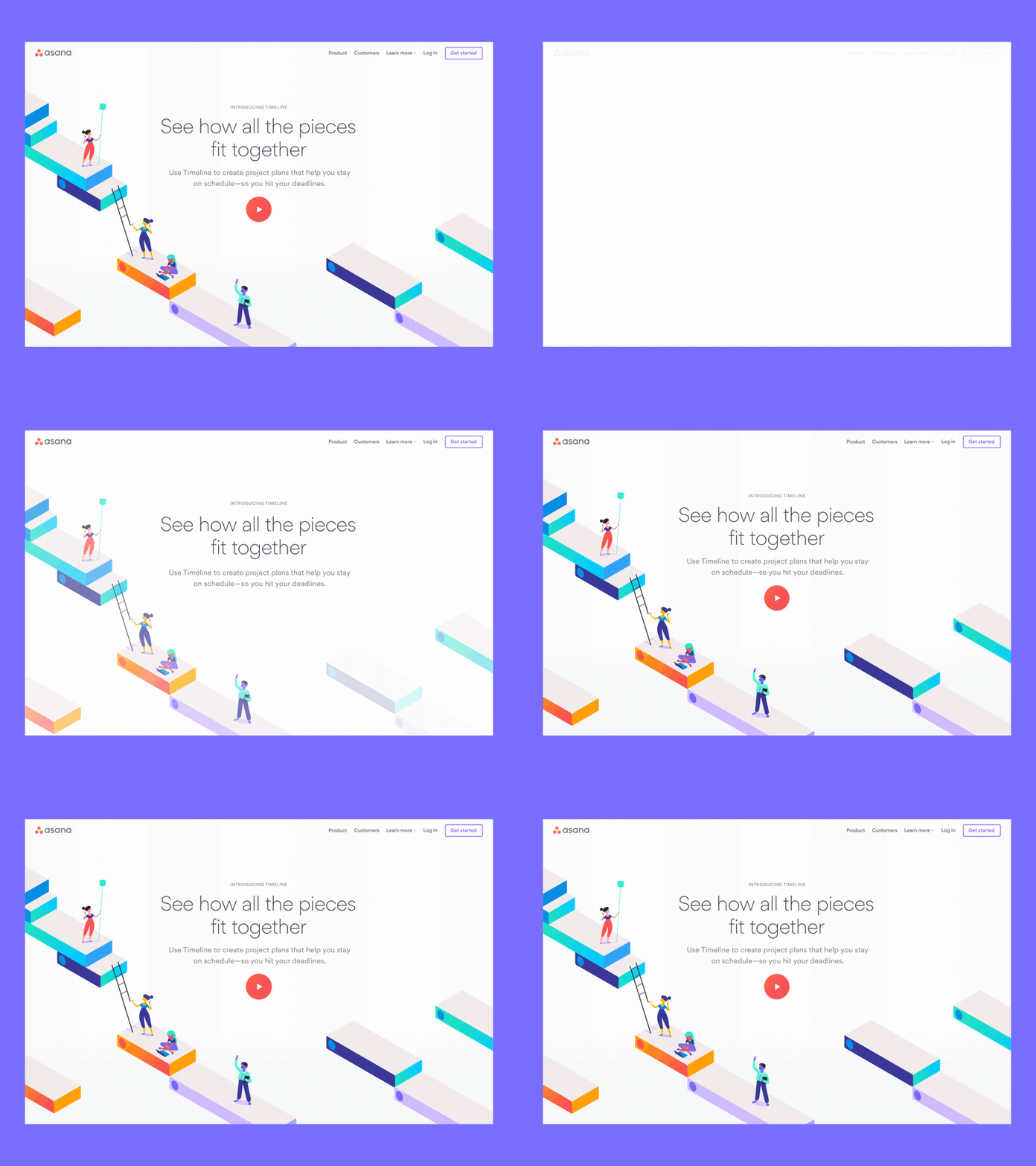
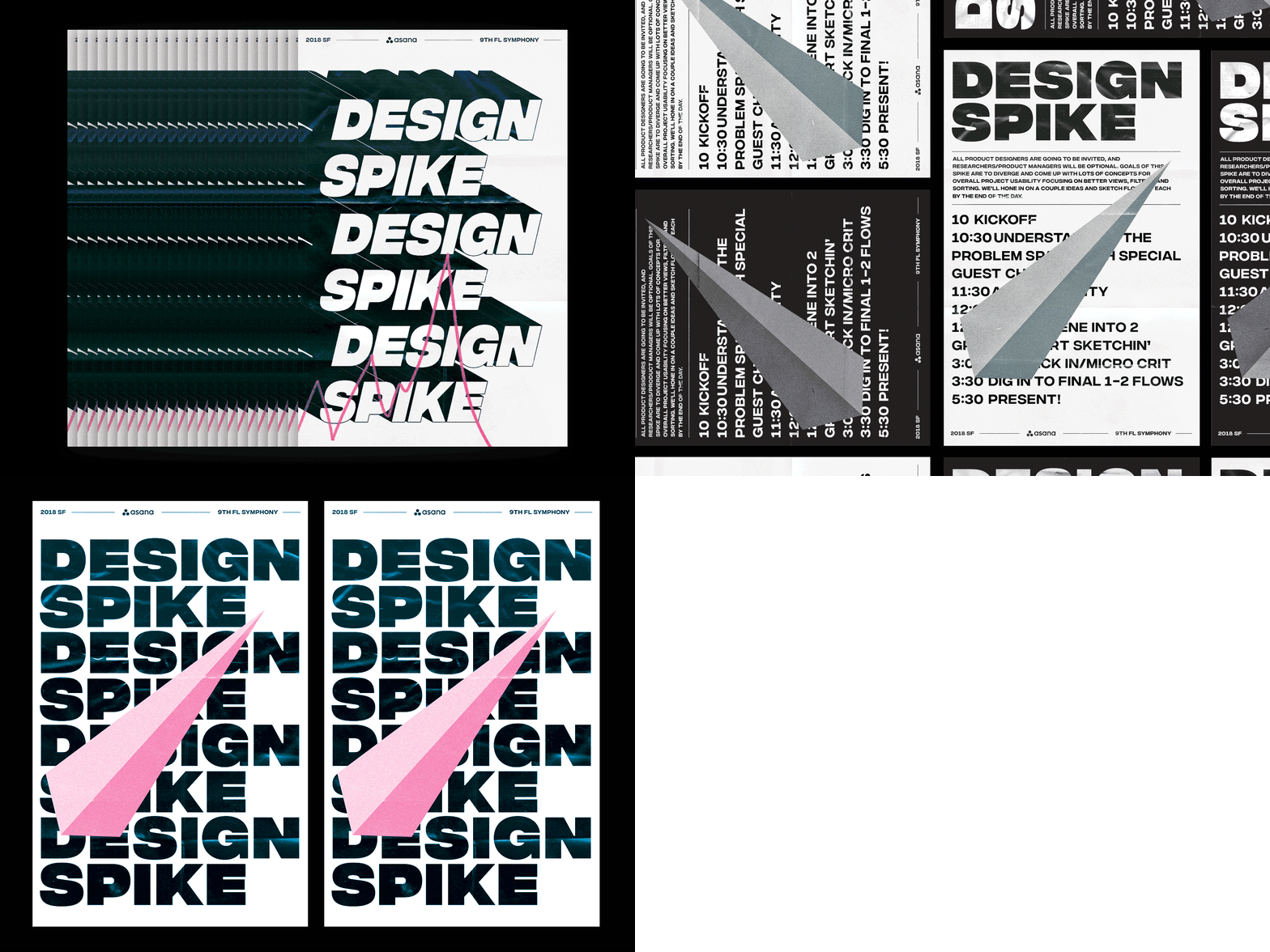
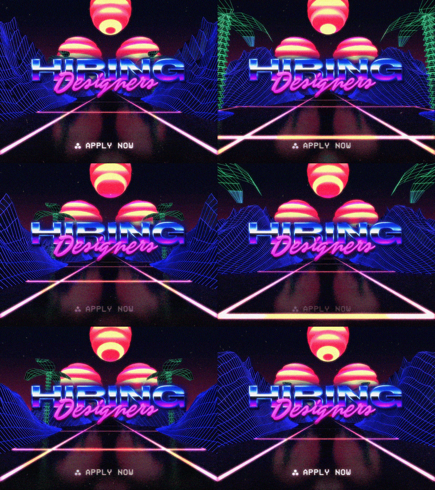
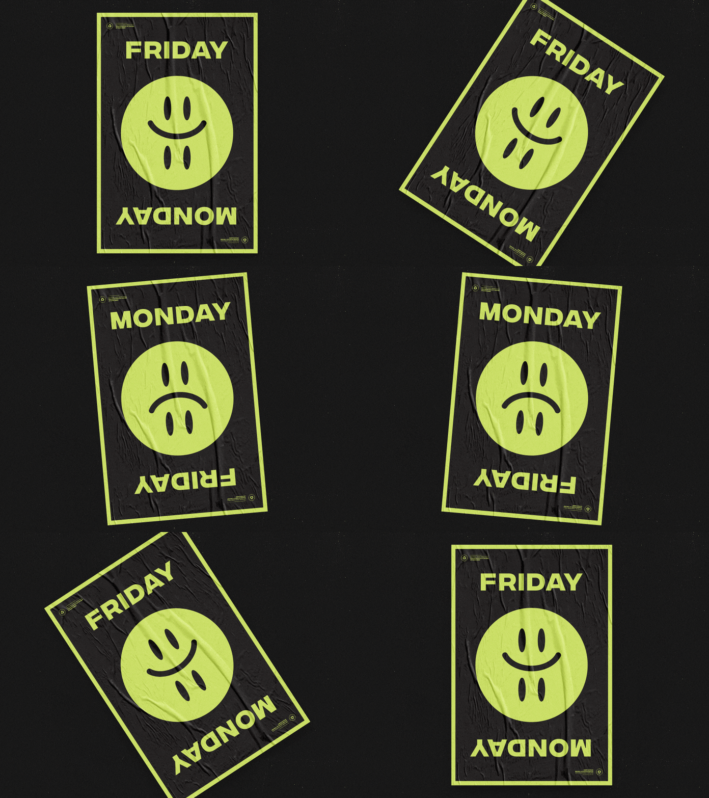
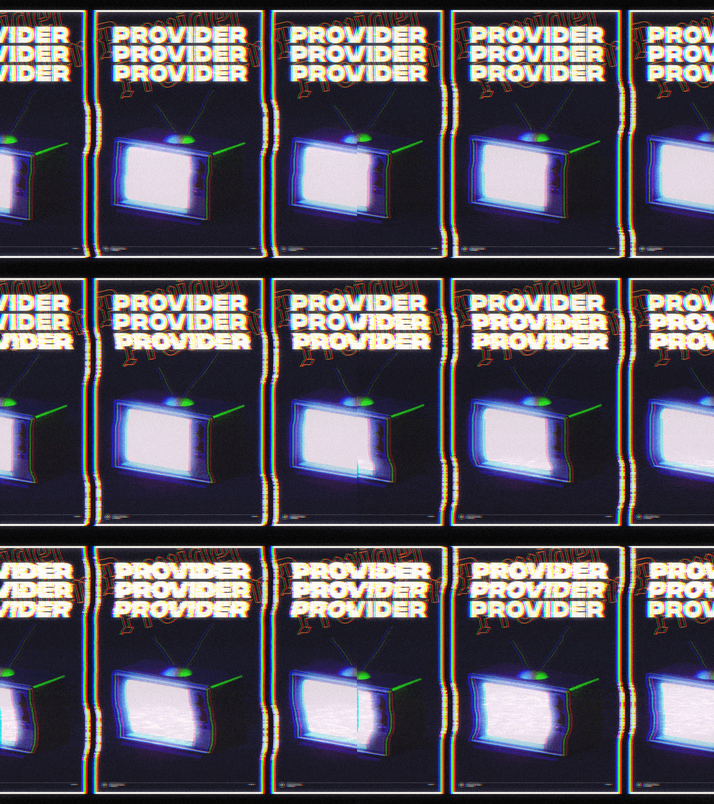
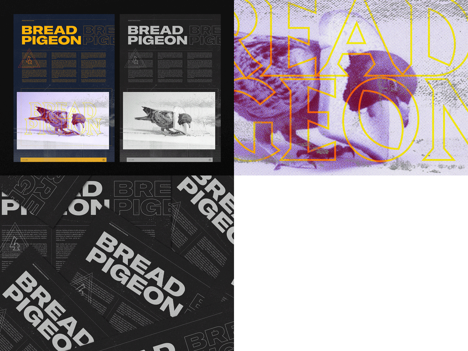
Outside of client work I’m always experimenting with new styles, tools, and techniques and seeing how I can combine various disciplines to explore new ideas. A lot of that work lately has come in the form of posters because of how quickly they can be made. It gives me an outlet to experiment outside of the constraints of a particular project and let the tools inform what I’m making.
What design challenges do you face at your company?
Challenges at Asana are much like any other company in San Francisco right now. The product is doing really well so we’re growing fast, producing a ton of work, and continuously trying to speed up our output so we can meet company goals. Asana also started with some very different ideas on company structures which worked great while we were small but as we grow a lot of them need updating and that’s always tough to do. Overall Asana is doing a great job in these areas. Everyone is super open to feedback and very proactive at addressing pain points as they arise.
What music do you listen to while designing?
Any advice for ambitious designers?
Don’t compare yourself to others. Work hard but pay attention to your mental health. If you start to feel burnt out take a break, your computer will be there when you’re ready for it. Learn how to take criticism and be open to feedback, it’ll only help you grow. This is a really competitive field and it helps to have friends outside of the industry. Those people can often provide more productive feedback than another designer. As someone who is wary to ask for help, don’t be afraid to reach out to people whether it’s asking for feedback or just letting someone know you like their work. Those people are often just as nervous as you might be and usually willing to help you out or have a conversation.
Anything you want to promote or plug?
You can follow me on Dribbble or Twitter. My portfolio is pretty scrappy and out of date but I plan on updating it soon 👀.
Other things I think are cool lately:
foreignrap.com, SuperHi, Font Review Journal, Bridge, and Webflow.


