What led you into design?
I’ve always had an interest in design but never properly considered it as a career option because I wasn't a stand out illustrator. When I moved to Sydney to pursue a degree in Business, I chose to major in marketing communications as I felt this would help balance out my creative interest. When I look back through my degree, a lot of my spare time was spent building presentations with animations, entering hackathons as a UI/UX designer or building app mock-ups on the side.
During my studies I held a job at Apple working on the Genius Bar, which meant I was either repairing people’s devices or helping them with their software questions. When it came to troubleshooting software, I had the opportunity to take a step back and observe how they were interacting with their devices to reproduce the issue, learn what they liked or didn't like or their creative workarounds when something wasn’t working – like using Siri with Voiceover to navigate their iPhone while their screen was cracked.
I was intrigued by the level of care and consistency Apple had for their entire ecosystem, all the way down to the smaller (sometimes invisible) details to make their interfaces feel second nature. I would see kids on the iPad table learning gestures like pinch to zoom or grandparents using burst mode to capture a series of photos, it was at this moment I knew I wanted to be part of building digital products.
I held a couple of internships in the marketing field, but I started to see that these roles were looking more strategically and not so much in the creative direction and therefore enrolled at General Assembly to study User Experience Design.
After wrapping up my Business degree I moved to Berlin and it was here that I ran into Florian Holstein, Head of Design at N26. I showed him some of my work, presented my case, and he brought me into the team. Fast forward a few years and I'm working at N26 as a Product Designer with the vision of building a bank the world loves to use.
What does a typical day look like?
My day kicks off with a stand-up in my product team to discuss our tasks from yesterday and move our post-its around on our physical JIRA board. I meet the rest of the Design team after lunch for a quick stand-up to ensure that we’re staying close and using synergies wherever we can. The rest of the day could be a mix anywhere from wireframing early concepts, building prototypes for user testing, working the feedback into the final designs, presenting to stakeholders or sitting with developers to discuss and handover assets.
Our teams are organized with a typical cross-functional approach, which means I get to sit within arm’s reach of our product manager, frontend, backend and QA engineers. Our agile coaches do a great job at facilitating our bi-weekly sprint plannings, reviews and retrospectives where we present and discuss what we’ve built over the last two weeks, and what we plan to tackle in the next.
Design has a lot of visibility at N26. Apart from the typical reviews with stakeholders there is also a lot of other touch points we have with the rest of the company. Every new employee, regardless of the department – be it Legal or Customer Service – gets a proper design onboarding to ensure that we’re not the team who does “fancy UI”. Design is so much more and everybody here influences the experiences of our customer. Our organization is very product-focused so we’re also communicating a lot in the company stand-ups. Working insights from user interviews into the product is one thing – presenting the insights and nuances how people use our product to the whole company is a completely different game.
I also talk quite regularly to the rest of the design team and my Design Lead. We end the week with a longer session where we present what we’ve built. It’s really crucial to not be a one-man show and have close connections to Communication Designers and of course the Product Designers in other teams.
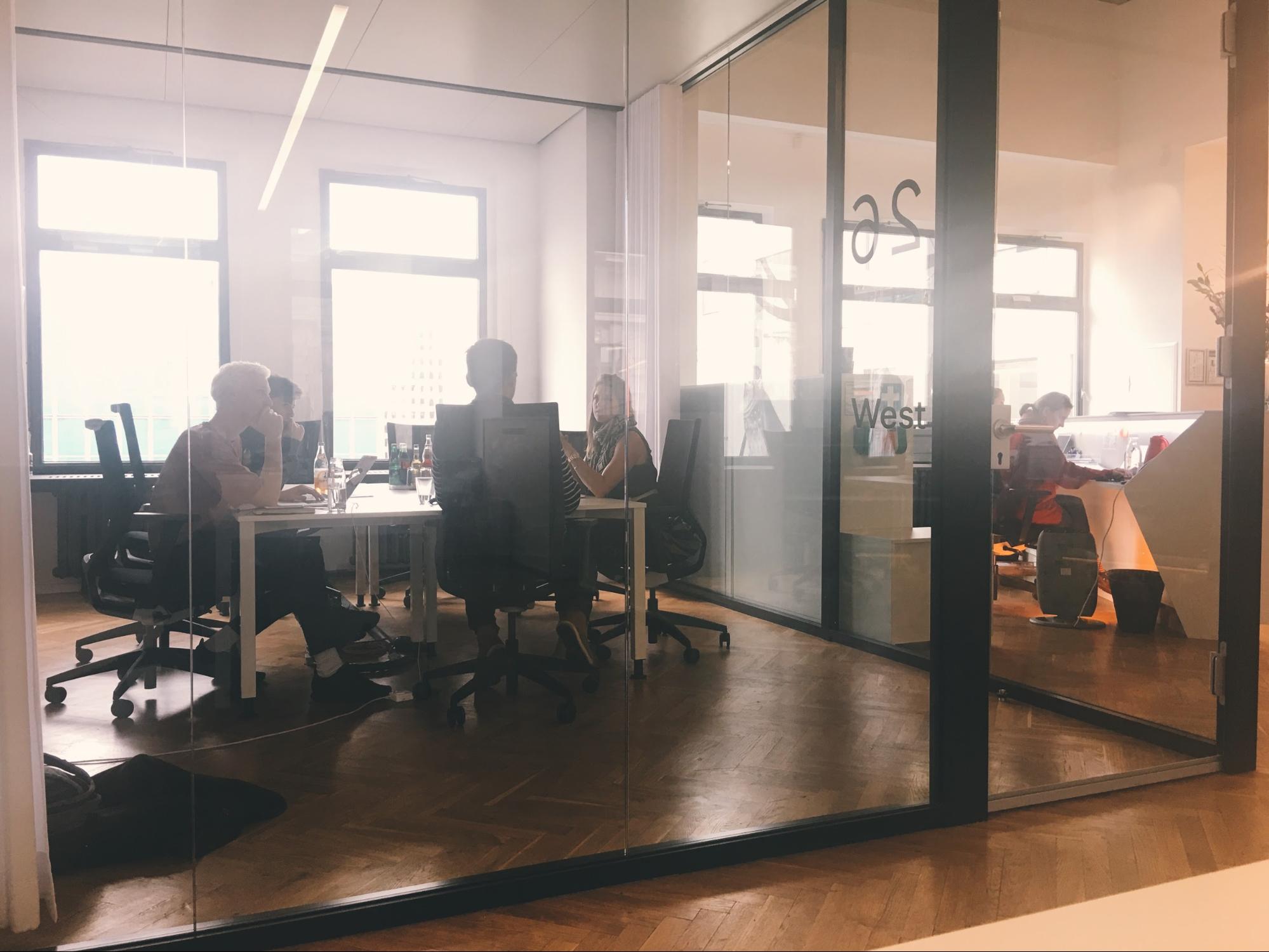
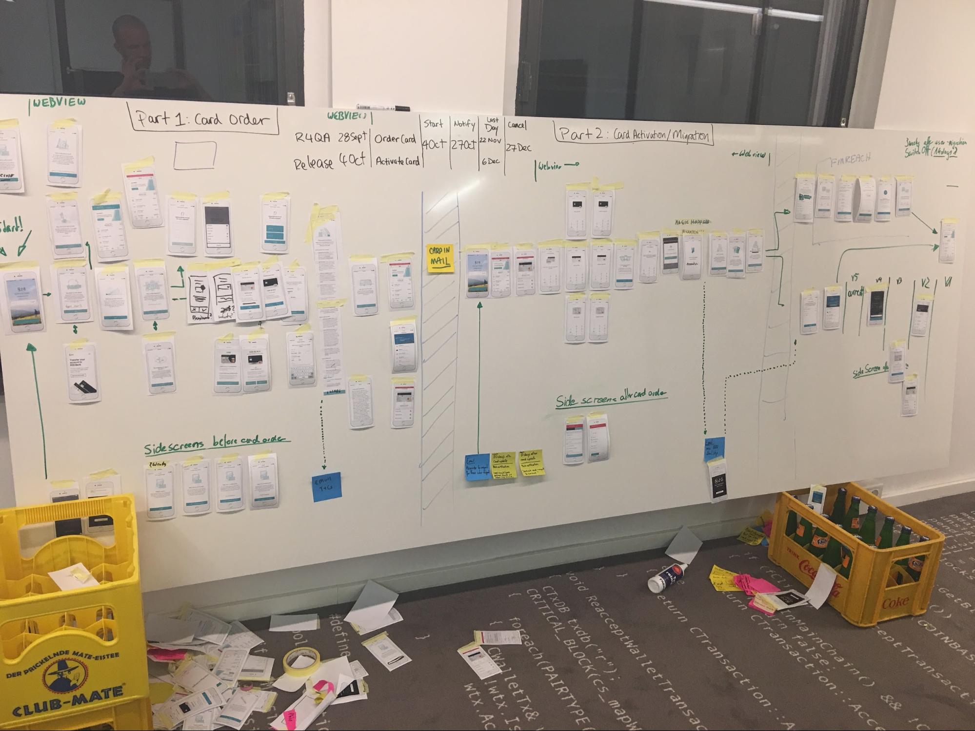
What’s your setup?


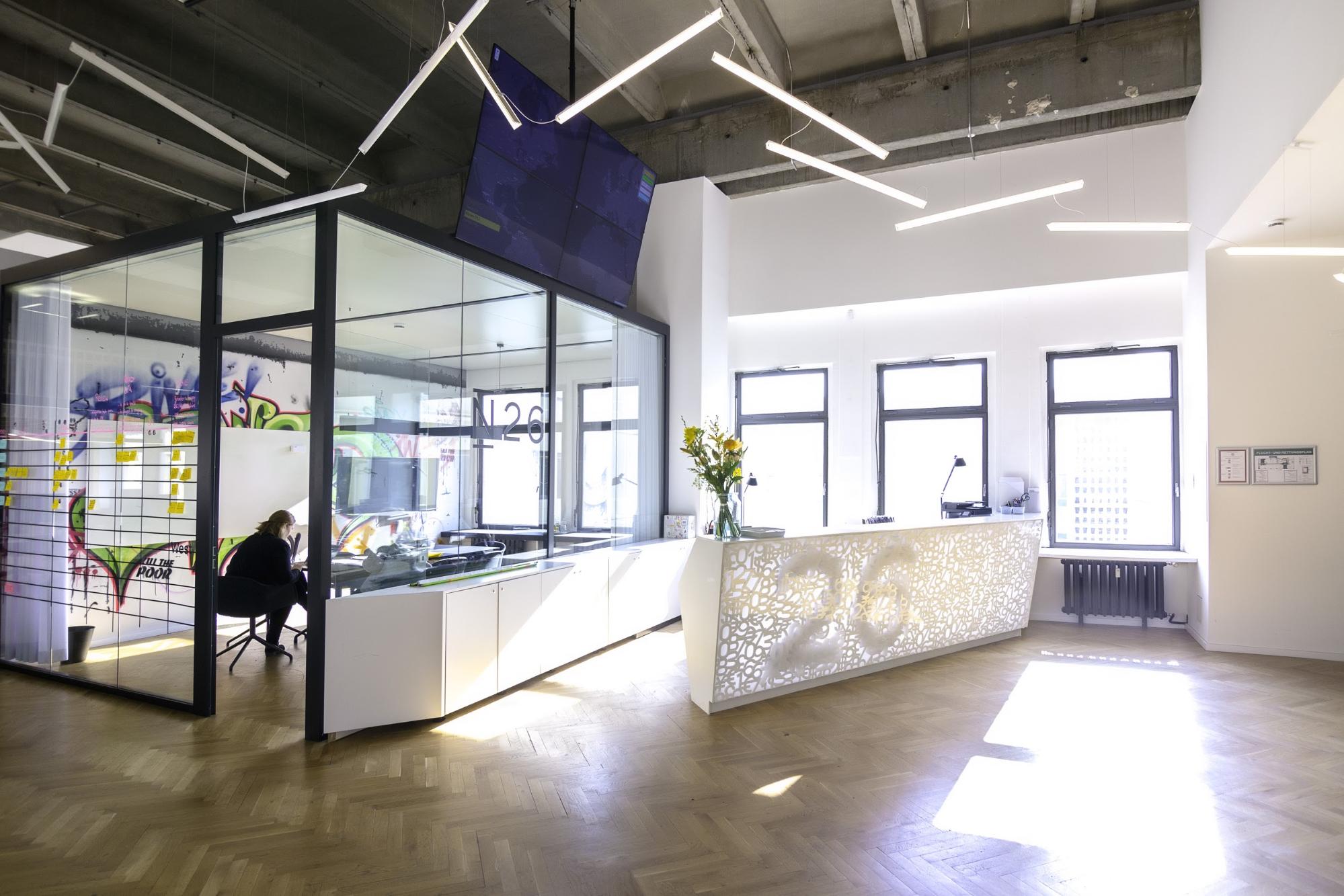
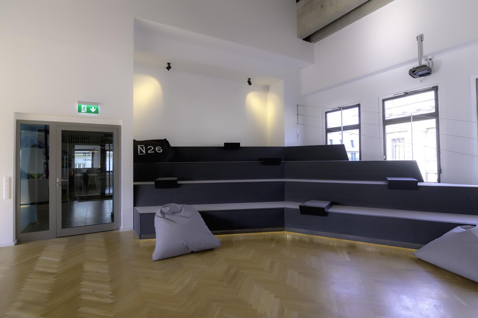
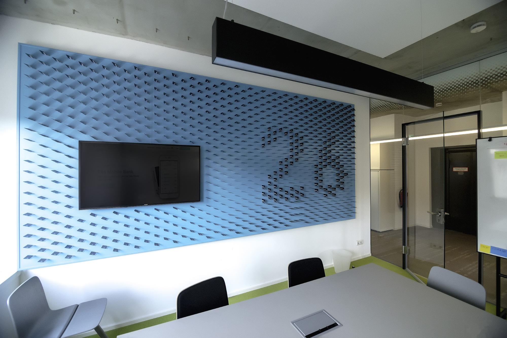
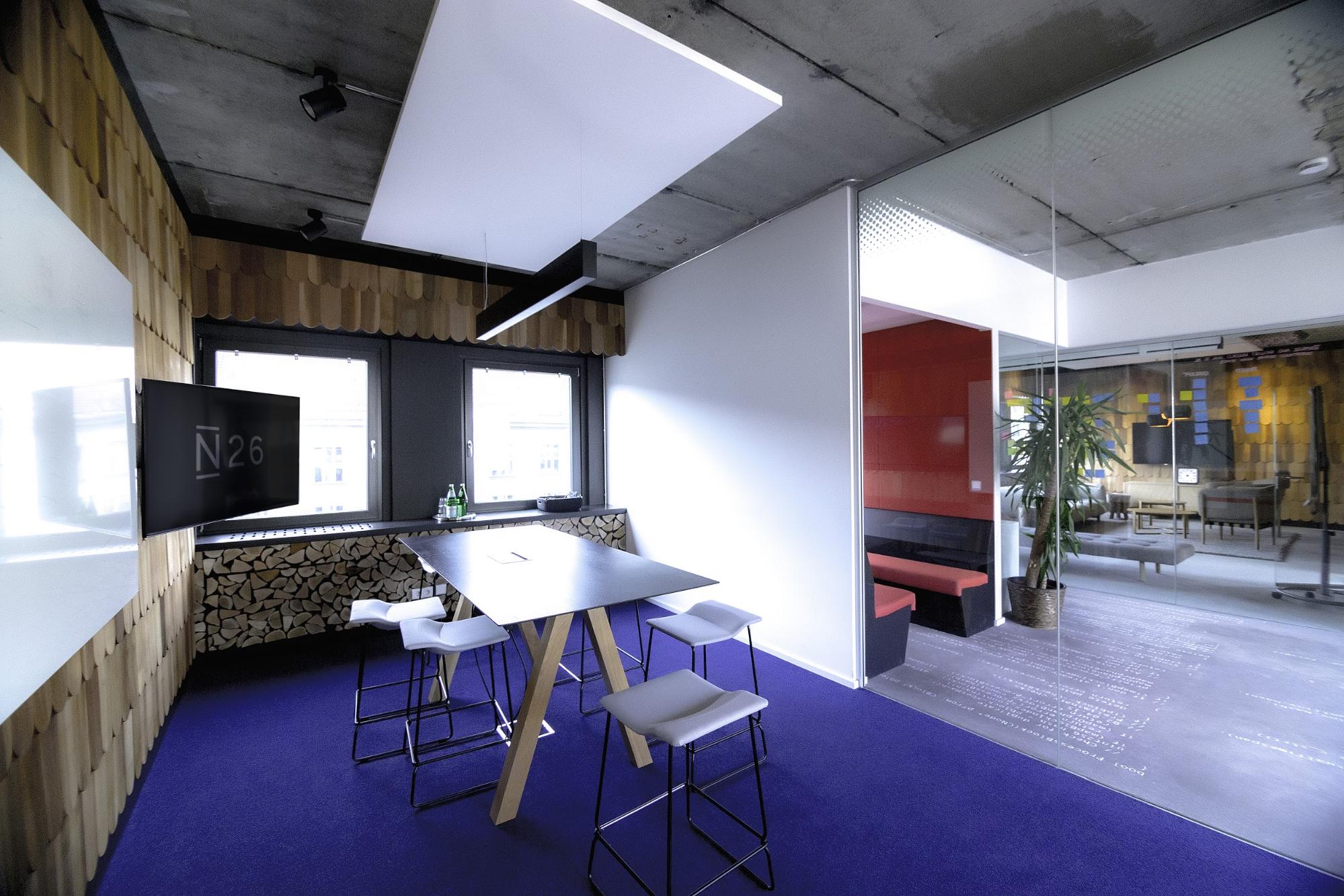
Where do you go to get inspired?
All of the online communities like Dribbble, Littlebigdetails, UpLabs, Panda and Muzli are all good places to start - but you can get super lost down that rabbit hole if your explorations aren’t timeboxed.
I also hoard screenshots from nearly every app I use and organize them in a Google photos album.
Outside of work I like to visit museums and art galleries while around the city I grab as many posters, brochures and post-cards I can find, so my backpack is constantly filled with odd pieces. I use these as starting points and inspiration in other projects or I colour pick them to create some nice palettes.
The posters here in Berlin pack some serious heat and I’m particularly drawn to those coming from Griessmühle (top) and Designer / DJ Luca Lozano (bottom). With heavy swiss influence, rough textures and blunt colors, for me it truly emphasises the hammer-driven, noise-drenched atmosphere at these events.

What product have you recently seen that made you think this is great design?
Google Trips really stands out for me as it was the first time I told my mother to download and app to use and she immediately ‘got it’. For her though she said it dances a thin line between “Hey, it knows everything!” to “Ehhhh, how does it know everything...” but I dig it and lean towards the former.
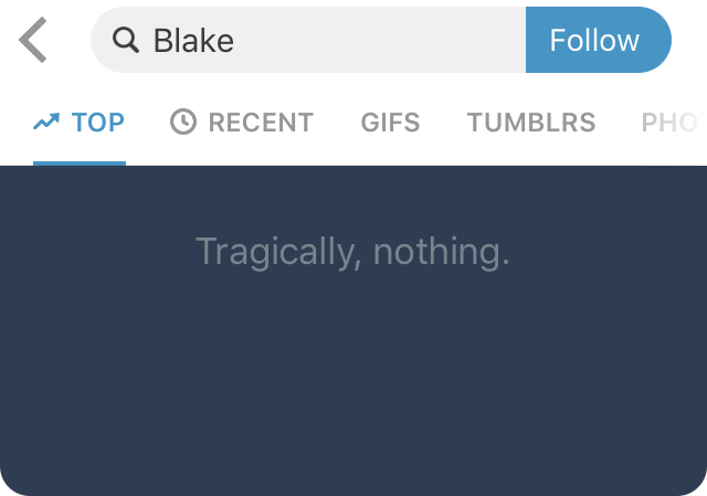
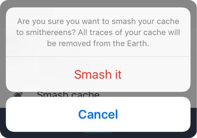
Design is also in the copy, and Tumblr is a perfect example of understanding their user base and developing a tone of voice that really speaks to them, it’s witty, sarcastic and it works.
Honorable mentions worth checking out: Headspace, GridDiary, Skyscannerand Citymapper
What pieces of work are you most proud of?
I’m proud of what the team pulled together for the Credit feature we launched here at N26. When the idea was initially drafted to allow customers to request a loan up to €25,000 we were pretty excited to see how we could turn a traditionally dry banking product into something more engaging or even delightful to use.
Applying for a credit is a deeply personal request. It takes a lot deliberation and requires the utmost trust from our customers. With this in mind we focused heavily on building that relationship with informative and engaging feedback loops, playful animations and providing clarity for unfamiliar terms.
I feel we really pushed the market forward with this feature as all that’s required is to answer a few questions about your current financial situation, choose a plan, verify and sign your contract via video call and receive the money all under 2 hours. Rapid stuff.

What design challenges do you face at your company?
At this stage designing for scale is the biggest focus for the team. Since we started out in 2015 we’ve received a full banking license, launched in 17 countries and have 500.000 customers. That’s a lot of people who trust us with their money. Prioritizing the right things with the long game in mind is a challenge for sure. We can’t throw features out to our customers without completely understanding where this will sit in our product in 1-2 years.
The organization also grew to more than 300 employees now. Which obviously is super exciting, but as we’re growing we also need to make sure that design is understood in the right way. We’re questioning, collaborating and communicating a lot – we’re not just making stuff “look beautiful”. This is why we’re taking the time to do many things on the side: e.g. the design onboarding sessions for new employees or inviting random people from other departments to sit in our Friday Reviews.
Designing at scale also means that we had to rethink our crafting approach in general. With our N26 Design System we had to understand our interfaces at an atomic level so that we can be more efficient in building features, not just for now but also in the future.
To remedy this, we’ve also started to reach out to other companies for Knowledge Swap Google Hangouts to discuss our processes, talk about pain points and to learn from each other – shoutout to the talented teams at Airbnb and Headspace.
What music do you listen to while designing?
Any advice for ambitious designers?
- Collect as much as you can to repurpose it later
- Consistently put your work in front of fresh eyes, especially for copy. It’s too easy get caught up with internal jargon
- On that note: write more copy, it’s a huge undervalued part of design
- Change your phone’s system language and play around with apps to see how you can move around them and understand their usability
- Find a mentor
- Get a desk plant 🌿
Anything you want to promote or plug?
Check out N26 and open your mobile bank account in just 8 minutes – no paperwork needed. We’re of course also on dribbble and we’re always looking for talented designers to join the crew.
Also, check out my insta. ✌️


